Your dashboard screenshots are accurate, your slide deck is clean, and the visuals still disappear from memory the moment the meeting ends. Then you open an AI image generator, type “manga style,” and get glossy fan-art clichés that do nothing for the brand, the audience, or the message.
That happens because manga is not a single look. It is a set of visual systems. Each one signals something different: speed, tension, intimacy, optimism, technical clarity, or futuristic ambition. If you are using Midjourney or a similar tool for thumbnails, training graphics, ad concepts, onboarding art, or internal comms, style choice affects whether the image reads as useful communication or decorative noise.
The business question is simple. What should the image make people feel, and how fast should they understand it?
That is where manga styles become practical for non-artists. Shonen-inspired composition can add momentum to a product launch visual. Josei cues can make lifestyle branding feel more credible and emotionally literate. Minimalist line work can keep an explainer graphic readable instead of overproduced. The trade-off is control. The more dramatic the style, the easier it is for AI to drift into spectacle, and the harder it becomes to keep layouts, props, and brand details consistent.
I use manga references the same way I use design direction in a campaign brief. Not to make something “look anime,” but to give the model better constraints. If you want stronger starting points, this collection of Midjourney anime prompt examples is a useful reference for phrasing style, mood, and character cues more clearly.
What follows focuses on ten manga art styles that can serve business goals. For each one, the key question is not whether it looks good. It is whether it helps the image communicate to the right audience, in the right tone, with enough consistency to use across a brand system.
1. Shonen Jump Style
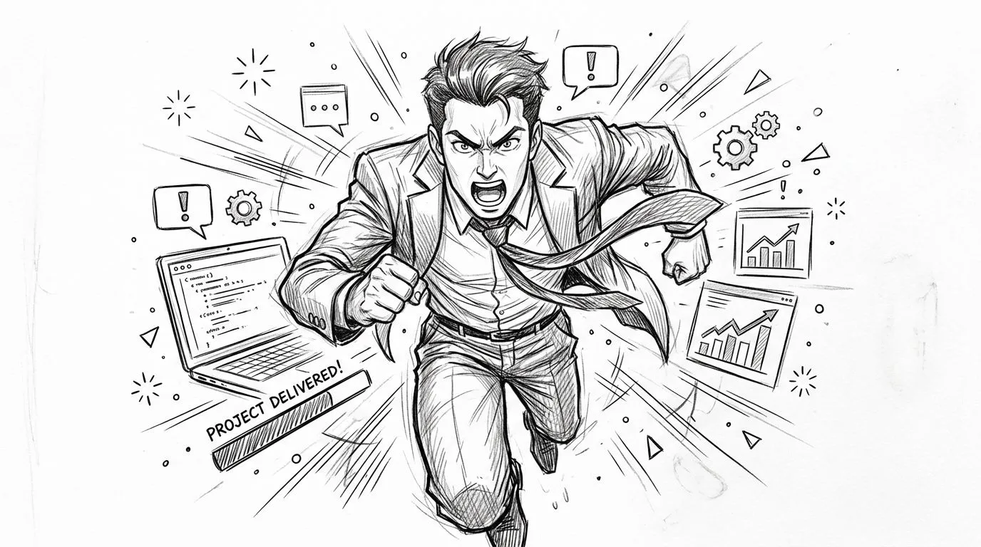
Your team is announcing a product launch on Monday, and the draft visual looks flat. The message says speed, progress, and confidence. The image says stock photo. Shonen fixes that gap fast because it is built around motion, stakes, and emotional payoff.
This style pulls from the visual grammar popularized in weekly battle and adventure manga: forceful poses, directional speed lines, sharp expressions, bold blacks, and compositions that push the eye forward. You can see that DNA in One Piece, My Hero Academia, Jujutsu Kaisen, and Dragon Ball. For AI image work, that matters less as trivia and more as a prompt strategy. You are describing momentum, not just asking for "anime."
Why it works in business visuals
Shonen is strong when the business message is about progress people should feel immediately. Product launches, milestone posts, recruiting campaigns for high-energy teams, YouTube thumbnails, webinar covers, and internal announcements about a new workflow all benefit from that charge.
It is also easy to overuse.
A compliance guide, investor update, or executive summary usually needs control and credibility more than adrenaline. If you add explosive posing and heavy action effects to a calm, information-dense asset, the style competes with the message instead of supporting it. Good art direction starts with the communication goal, then picks the manga language that fits.
Use shonen for transformation moments: a sales rep closing the week strong, an ops manager clearing a backlog, a founder shipping a new feature after a long sprint. Those scenes give Midjourney something concrete to build around, and they keep the result useful for brands that want energy without visual chaos.
Practical rule: Use shonen when the audience should feel momentum before they read the copy.
A strong prompt starts with role, action, and business context, then adds the visual cues that make the output read as manga instead of generic digital illustration.
shonen manga style art of a product manager celebrating a successful launch, dynamic forward motion, dramatic perspective, bold ink lines, speed lines, halftone shading, high contrast lighting, confident expression, clean modern business clothing, background hints of dashboards and launch graphics, aspect ratio 16:9, style raw
If you want more working examples, browse these Midjourney anime prompt references for business-friendly outputs.
- Best use case: Campaign art for launch announcements, tutorial thumbnails, and "before vs. after" AI productivity content.
- Bad use case: Board presentations, policy documents, or trust-sensitive finance visuals.
- Prompt fix: If the image turns too painterly, ask for "bold ink lines," "halftone shading," and "high-contrast manga rendering." If it turns too chaotic, reduce the effects and specify "clean focal subject, limited background action."
2. Seinen Style
A founder needs artwork for an investor update by 3 p.m. The image cannot read as childish, loud, or entertainment-first. Seinen is the right call when the visual has to signal adult judgment, operational weight, and control.
Compared with shonen, seinen uses more grounded proportions, tighter facial acting, and settings that carry real narrative information. The room matters. The lighting matters. The character usually looks like they have a job, a deadline, and a reason to be there. For AI image generation, that makes prompting easier. You can specify role, environment, and mood, then let the style do the credibility work.
Reference points include Vinland Saga, Berserk, Planetes, and the manga-adjacent visual language often associated with mature sci-fi thrillers such as Psycho-Pass. The shared thread is not violence or darkness. It is restraint, detail, and adult stakes.
Where to use it
Seinen works well for whitepaper covers, investor-facing blog art, strategy visuals, hiring campaigns for senior roles, and internal communications about change, risk, or execution. If the audience includes executives, technical buyers, or operators, this style usually holds up better than louder manga variants.
It also solves a common AI problem. Generic prompts often produce a polished character floating in a vague background. Seinen gives you permission to ask for setting-specific detail, such as a late-night office, a train commute, a manufacturing floor, or a conference room after a difficult review. Those details make the image feel useful instead of decorative.
Use prompts that anchor five things clearly: subject, job context, environment, expression, and rendering style.
seinen manga art style, senior product strategist reviewing a risk dashboard before a board meeting, realistic adult proportions, detailed conference room interior, city lights outside the window, restrained expression, fine ink linework, controlled halftone shading, muted blue and charcoal palette, cinematic lighting, professional business clothing, 16:9, style raw
A second version for operations or B2B content:
seinen manga illustration of an operations lead checking supply chain metrics on a large monitor wall, grounded anatomy, industrial office environment, precise background detail, subtle fatigue, intelligent focused expression, crisp linework, selective shading, low-saturation color palette, dramatic but clean composition, 16:9
- Best use case: Whitepaper hero images, executive webinar covers, thought-leadership posts, and AI transformation content aimed at serious buyers.
- Bad use case: Kids' products, playful onboarding, celebratory launch art, or anything that needs instant warmth.
- Prompt fix: If Midjourney makes it too noir, replace "dark" with "controlled lighting" and "muted palette." If it gets too generic, add a specific workplace setting and a concrete task.
A few art-direction rules help. Ask for emotional restraint instead of exaggerated reactions. Keep the palette narrow. Add environmental clues that support the message, such as documents, dashboards, transit maps, factory panels, or architectural detail. If the result starts drifting into cyberpunk, reduce the neon and specify "contemporary business setting" or "real-world office materials."
Seinen fails when prompts confuse maturity with grit. Professional-looking images are usually built from specificity, not from darkness.
3. Josei Style
A brand team needs a manga visual for a campaign about burnout, flexibility, or career identity. Shonen pushes it into action. Seinen can make it feel cold. Josei usually gives the better read because it handles adult life, taste, and emotion without turning the image into stock-photo wellness.
Josei is built for relational detail. Clothing feels considered. Posture carries meaning. Rooms look lived in, not staged. Office corners, apartments, cafés, transit scenes, and shared workspaces all matter because the setting supports the emotional message. For AI image generation, those background cues are not decoration. They help Midjourney produce a scene that feels specific to the audience you want.
The reference point is adult-oriented manga centered on work, romance, identity, and social dynamics. Titles often mentioned in this conversation include Wotakoi and other series that treat modern adult life with polish and emotional nuance. A few crossover titles get cited for pieces of the look, but the practical takeaway is simple. Ask for mature interpersonal tone, refined styling, and everyday realism.
Use josei for messages about confidence, balance, aspiration, creative work, and professional self-definition. It works especially well for marketers, consultants, creators, community teams, coaching brands, and lifestyle-adjacent B2B campaigns where trust matters more than intensity.
Prompting needs more precision here than in broader manga categories. “Woman at laptop” gives generic output. A stronger prompt names the role, age signal, environment, wardrobe, and emotional state.
josei manga illustration of a brand strategist reviewing campaign drafts in a tidy home office, refined fashion styling, expressive eyes, soft natural window light, muted blush and cream palette, modern desk accessories, calm focused mood, adult realism, polished interior detail, aspect ratio 4:5
For service businesses or creator education, try a version with clearer narrative intent:
josei manga style, a freelance consultant closing her laptop after finishing an automated workflow, relaxed shoulders, subtle sense of relief, stylish apartment workspace, elegant linework, soft editorial color palette, contemporary decor, intimate but professional tone, aspect ratio 4:5
Use josei when the image needs to feel personal, credible, and aspirational for adults who care about taste, routine, and emotional realism.
Good business fits:
- Content marketing: Workflow relief, creative burnout, time-saving systems, client communication.
- Recruiting and employer brand: Flexible work, team culture, mentorship, career progression.
- Course and newsletter art: Material aimed at busy professionals who want warmth without cartoon energy.
The trade-off is clear. Josei can soften the message too much if the campaign needs urgency, conflict, or high-stakes momentum. Fix that by tightening the crop, giving the character a concrete task, and reducing decorative background detail. If Midjourney makes it too dreamy, ask for “editorial realism,” “contemporary work setting,” and “focused expression” instead of “soft” or “romantic.”
4. Kodomo Style
Kodomo is where clarity beats style flexing. It's simple, rounded, cheerful, and easy to understand fast. For non-technical audiences, that's often exactly what you want.
If you're explaining what ChatGPT does, how to write a first prompt, or what an automation flow is, kodomo removes intimidation. Examples like Doraemon and Astro Boy show why simplified characters stay powerful. Osamu Tezuka helped establish a warm, emotionally expressive visual approach that still influences accessible character design across manga.
What to simplify
Don't just make the character cute. Simplify the entire communication system. Fewer objects. Clear gestures. Obvious emotional states. Plain backgrounds. Strong silhouette separation.
This style is especially good for onboarding assets, internal documentation headers, beginner course graphics, and whiteboard-style explainers. If the image has to teach something in under a few seconds, kodomo gives you less room to hide bad information architecture.
Try:
kodomo manga style, a simple and cute robot mascot character explaining a concept on a whiteboard, clean lines, bright primary color palette, rounded shapes, friendly expression, on a plain background, aspect ratio 1:1
- Good fit: Beginner tutorials, FAQs, chatbot onboarding, employee training.
- Poor fit: Luxury branding, cybersecurity threat visuals, high-stakes investor content.
- Prompt advice: Add “plain background” and “clean lines” so the model doesn't clutter the frame.
One practical note. Simple isn't the same as generic. Give the mascot a job, a pose, and a teaching role. “Cute robot” is weak. “Cute robot pointing at a 3-step workflow on a whiteboard” is usable.
5. Cyberpunk Sci-Fi Style
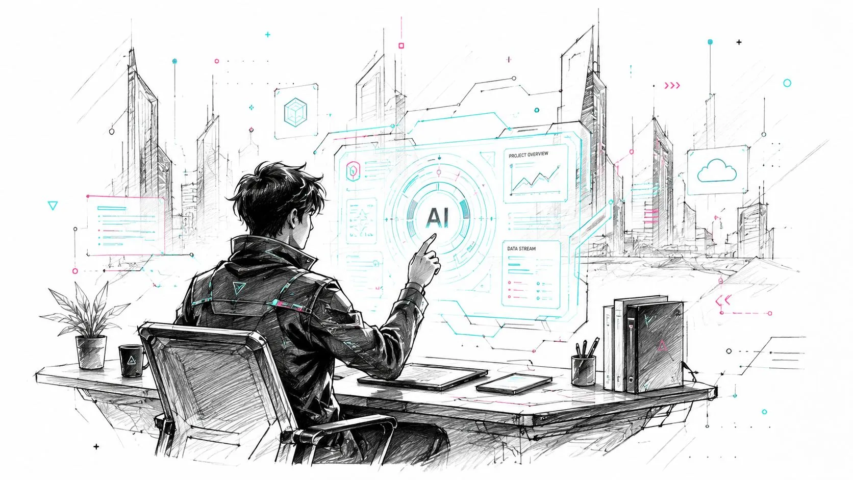
A prospect lands on your AI product page and gives you three seconds. Cyberpunk sci-fi style can tell them “advanced system, live data, machine interaction” before they read a headline. That speed is why this look keeps showing up in SaaS hero art, keynote screens, and launch campaigns.
The visual vocabulary is established. Akira, Ghost in the Shell, and Battle Angel Alita built a recognizable mix of neon lighting, dense interfaces, urban night settings, reflective materials, and human-machine tension. For non-artists using Midjourney or similar tools, that shared language is useful because the model already understands it. You can get closer to a credible result with fewer revisions than you would with a vague prompt like “future tech office.”
Used well, this style sells ambition. Used carelessly, it buries the message.
Where cyberpunk earns its place
Cyberpunk works best when the product itself benefits from a high-tech frame. Good examples include AI copilots, security platforms, data infrastructure, robotics, developer tools, and automation services that need to feel fast, technical, and slightly ahead of the market. It is also a strong fit for event posters, founder presentation decks, recruitment campaigns for engineering roles, and launch visuals for experimental features.
It is weaker for trust-first communication. If you are explaining compliance, pricing, onboarding steps, or customer support workflows, glowing overlays and glitch effects usually add noise faster than meaning.
Use the style to frame innovation. Keep the interface readable enough that the audience still knows where to look.
cyberpunk manga style, product marketing illustration of a professional using a holographic AI dashboard in a futuristic office, neon blue and magenta accents, high contrast lighting, reflective surfaces, dense but readable UI overlays, night city visible through glass, polished commercial composition, aspect ratio 16:9
A stronger business prompt usually adds role, device, and message hierarchy. “Professional at holographic interface” is acceptable. “CTO reviewing anomaly alerts on a transparent AI operations dashboard with one clear focal panel” is better because it tells the model what matters.
For teams building campaign assets, I usually set three constraints up front. One focal action. One branded accent color. One interface element that supports the headline. That keeps the image from collapsing into generic sci-fi wallpaper.
If you want more examples for this direction, browse these ChatGPT cyberpunk prompt ideas and adapt the visual language to your brand instead of copying the mood wholesale.
A final trade-off matters here. Cyberpunk signals sophistication, but it can also signal distance. If the image makes your tool look powerful and hard to understand, conversion suffers. Reduce background clutter, limit the number of glowing panels, and give the character a clear task. The goal is not “technology exists.” The goal is “this technology does something useful, and fast.”
6. Slice-of-Life Comedy Style
Some of the best business visuals aren't aspirational. They're familiar. Slice-of-life and comedy styles work because they make work pain recognizable without making it feel catastrophic.
Think of the exhausted analyst finishing a deck late at night, then the same person leaving on time after using AI to draft summaries or organize notes. The humor is mild. The emotional shift is clear. That combination makes this style great for email graphics, social posts, webinar creatives, and internal enablement campaigns.
Where relatability beats spectacle
Series like Nichijou and Daily Lives of High School Boys exaggerate everyday moments without losing their mundane core. That's useful in business communication. You can show inbox overload, meeting fatigue, or version-control confusion in a way that feels light rather than preachy.
slice-of-life manga style, a tired office worker at 10 PM vs the same person leaving work at 5 PM smiling, diptych, warm natural color palette, soft linework, focus on relatable, humorous expressions, aspect ratio 16:9
This style is strong when:
- You're selling relief: Productivity, automation, templates, and workflow support.
- You need a human tone: Internal comms, learning content, newsletter art.
- You want lower stakes: Not every AI message needs to feel groundbreaking.
It's weak for premium positioning. If you're announcing an enterprise platform or pitching executive transformation, comedy can undercut authority unless the brand voice already supports it.
A good prompt usually includes contrast. Before and after. Messy and calm. Frustrated and relieved. That narrative structure matters more here than visual complexity.
7. Minimalist Line Art Style
Minimalist line art is the most practical style in this list if your job involves instruction. It strips away drama and keeps attention on the concept. That makes it ideal for process graphics, icons, UI callouts, slide headers, and repeatable brand systems.
This style isn't traditional manga in the magazine sense, but it borrows from manga's discipline around silhouette, clarity, and expressive economy. For AI-generated business assets, that economy matters because clutter is the default failure mode.
How to keep it useful
A minimal prompt needs tight constraints. If you're vague, the model fills the blank space with gradients, textures, and unnecessary objects. Ask for one object, one action, one background treatment.
minimalist single line art, a brain icon with a gear inside, black on a white background, clean, modern, professional, vector style, aspect ratio 1:1
Use this style for systems, not scenes. A set of icons for ChatGPT, Claude, Midjourney, and Perplexity. A consistent mascot outline for onboarding. A clean hero image on a presentation cover. It's especially useful when the rest of your design already carries a lot of information.
- Best for: Diagrams, repeatable templates, branded educational content.
- Less useful for: Emotional storytelling, campaign splash images, cinematic brand work.
- Prompt correction: Add “white background” and “vector style” if outputs keep becoming painted illustrations.
This is also the safest style for teams that need consistency over flair. If multiple people are generating images, minimalist constraints produce fewer off-brand surprises.
8. Atmospheric Mood-Driven Style
Atmospheric manga-inspired visuals are less about information and more about emotional framing. They work when you need to show possibility, transition, relief, focus, or the quiet satisfaction of mastering a new skill.
Makoto Shinkai's film work is the obvious reference point for many people because of its sky treatment, lighting, weather, and sense of emotional space. In business settings, that translates well to campaign art around reinvention, learning, and future direction.
Use emotion with restraint
A strong atmospheric image can enhance a webinar banner, a landing page hero, or a lesson cover for career-oriented AI education. Sunrise over a city. A professional standing at a window. Warm light after a difficult stretch. These images communicate movement without literal action poses.
atmospheric anime art style of Makoto Shinkai, a professional looking out a window at a sunrise over the city, warm golden hour lighting, lens flare, detailed clouds, feeling of hope and new beginnings, painterly digital art, aspect ratio 16:9
The trade-off is precision. Mood-heavy visuals are memorable, but they rarely explain anything on their own. Use them when the copy already does the instructional work.
For adjacent inspiration in softer cinematic worlds, you can also generate Ghibli scenes with Nereo.
The image should support the message's emotional temperature. If the copy is tactical, don't bury it under a sentimental sky.
A simple rule helps here. Use atmospheric visuals at the top of the funnel. Use clearer styles deeper in the workflow.
9. Technical Educational Infographic Style
A common business scenario is simple. The team needs one graphic that explains a workflow, a tool stack, or a four-step prompt process to people who do not want to read a long document. This style handles that job well because it combines manga character clarity with the logic of a diagram.
Used properly, it turns abstract systems into something people can scan in seconds. That makes it useful for course slides, onboarding docs, webinar visuals, product explainers, and internal AI training.
Structure the prompt like an information designer
The model needs clear instructions about hierarchy, not just aesthetics. Specify the number of steps, where arrows should flow, what gets grouped, and which element acts as the guide. If you leave the structure vague, the image usually comes back decorative instead of instructional.
educational manga-style infographic explaining a 4-step AI workflow, clean technical illustration, guide character pointing to each stage, numbered circles, directional arrows, labeled modules, simple isometric panels, blue and green palette, white background, clear visual hierarchy, aspect ratio 16:9
For brand use, I recommend treating the AI output as the base illustration, not the finished asset. Image models still distort text, labels, and UI details. Generate the composition first, then place the actual copy in Canva, Figma, or PowerPoint so the final graphic is readable, editable, and consistent with your brand system.
If your infographic uses a recurring guide character across multiple lessons, this tutorial on creating consistent AI characters with RenderNet is a practical next step.
Here's a visual example format worth studying:
The main trade-off is density. This style explains process well, but it gets messy fast if you ask one image to teach an entire system. Keep each asset focused on one workflow, one comparison, or one decision path. Teams get better results from a series of simple panels than from one overloaded poster.
10. Character-Driven Mascot Style
A product team ships six onboarding screens, three webinar promos, and a weekly newsletter. The copy changes. The offer changes. The one thing users remember is the same guide character showing up every time. That is why mascot style works. It gives abstract products a recognizable face, which helps AI education, SaaS marketing, and internal training feel familiar faster.
Used well, a mascot turns brand voice into something visual. A robot owl can stand for prompt coaching. A calm fox can represent analytics. A task-focused cat can carry automation reminders. That role clarity matters more than cuteness, especially in thumbnails, onboarding flows, tooltips, course libraries, and social content where attention is short.
How to make mascots usable
Treat the mascot as a system, not a single illustration. For production, that means fixed proportions, a small expression set, a controlled color palette, and clear rules for wardrobe, accessories, and poses. If those rules are loose, image models drift. The character starts looking like a new mascot every week, which defeats the branding value.
cute and professional mascot for an AI learning company, a friendly robot owl with glasses, simple character design sheet, various expressions happy thinking confused, flat vector art style, brand colors, aspect ratio 16:9
For better outputs, ask for a character sheet before asking for campaign assets. Then generate use cases from that base: waving for onboarding, pointing for tutorials, celebrating for product wins, concerned for common mistakes. Teams that need repeatable results across a course or content series should follow this guide on creating consistent AI characters with RenderNet.
The trade-off is range. Mascot style is excellent for recall and approachability, but it can make serious subjects feel lighter than intended. It fits onboarding, education, support, and community programs better than high-trust executive sales collateral.
A few business uses consistently hold up:
- Training paths: assign one mascot to beginner guidance and another to advanced workflows.
- Department content: create distinct characters for marketing, analytics, sales, or HR.
- Prompt education: use facial reactions and pose changes to show strong prompts, weak prompts, and avoidable mistakes.
Mascot-driven visuals are well-known in anime and manga-influenced product culture, so audiences usually read them quickly without extra explanation. The practical takeaway is simple. If you want recognition across repeated touchpoints, build one character system and reuse it with discipline instead of generating random heroes for every asset.
10-Style Manga Art Comparison
| Style | 🔄 Implementation complexity | ⚡ Resource / speed | ⭐ Expected outcomes | 📊 Ideal use cases | 💡 Key advantages & tip |
|---|---|---|---|---|---|
| Shonen Jump Style (Action-Oriented Realism) | 🔄🔄🔄, dynamic poses & panels (skilled draftsmanship) | ⚡⚡, time-intensive sequential art | ⭐⭐⭐⭐, very high engagement and urgency | Marketing thumbnails, tutorial transformations, attention-grabbing ads | 💡 Highly engaging; use high-contrast shading and speed lines for before/after workflow visuals |
| Seinen Style (Realistic Detail & Sophistication) | 🔄🔄🔄🔄, detailed anatomy & environments | ⚡, high skill + time, costlier production | ⭐⭐⭐⭐, builds credibility and authority | Executive case studies, C‑suite marketing, professional development | 💡 Use realistic office scenes and nuanced expressions to convey trust |
| Josei Style (Character-Driven Femininity) | 🔄🔄🔄, refined character work and fashion details | ⚡⚡, moderate time and styling expertise | ⭐⭐⭐, strong emotional relatability for target demos | Marketing to female professionals, lifestyle case studies, creator audiences | 💡 Leverage fashion-forward settings and subtle expressions; avoid stereotypes |
| Kodomo Style (Simplified & Accessible Design) | 🔄, simple forms, low technical complexity | ⚡⚡⚡, fast and cost-effective at scale | ⭐⭐⭐, high accessibility and clarity | Beginner tutorials, onboarding, infographics, mascots | 💡 Use cheerful mascots and clear diagrams to lower learning barriers |
| Cyberpunk / Sci‑Fi Style (Futuristic & Technological) | 🔄🔄🔄🔄, complex lighting, effects, and color coordination | ⚡, can be slow; needs color/design expertise | ⭐⭐⭐⭐, distinctive, innovation-forward positioning | Branding for tech entrepreneurs, future‑focused campaigns, visionary visuals | 💡 Apply neon accents and holographic effects sparingly to avoid visual clutter |
| Slice-of-Life / Comedy Style (Relatable & Warm) | 🔄🔄🔄, character timing and subtle humor needed | ⚡⚡, moderate production effort | ⭐⭐⭐, strong relatability and shareability | Storytelling, testimonials, day‑in‑the‑life marketing | 💡 Use gentle humor and before/after vignettes to humanize AI benefits |
| Minimalist / Line Art Style (Clarity & Focus) | 🔄🔄🔄, deceptively skilled minimalism, strong composition | ⚡⚡⚡, efficient once systemized; low production cost | ⭐⭐⭐⭐, excellent clarity, professional polish | UI/UX, icons, clean tutorials, platform interfaces | 💡 Prioritize negative space and consistent iconography for instant comprehension |
| Atmospheric / Mood‑Driven Style (Emotional Engagement) | 🔄🔄🔄🔄, advanced lighting, color grading, atmosphere | ⚡, resource‑heavy; slow to produce | ⭐⭐⭐⭐, powerful emotional resonance and premium feel | Aspirational campaigns, brand films, vision/transformational messaging | 💡 Use golden‑hour lighting and color temperature shifts to show transformation |
| Technical / Educational Infographic Style (Information Architecture) | 🔄🔄🔄🔄, demands strong info‑design & systems thinking | ⚡⚡, time upfront; efficient with templates | ⭐⭐⭐⭐⭐, maximum clarity and learning effectiveness | Tutorials, workflow diagrams, prompt engineering guides, tool comparisons | 💡 Use numbered steps, color coding, and consistent icons to simplify complex concepts |
| Character‑Driven / Mascot Style (Brand Personality) | 🔄🔄🔄, consistent character design across contexts | ⚡⚡, moderate initial investment; reusable assets | ⭐⭐⭐⭐, strong brand recall and engagement | Branded tutorial guides, onboarding, social media, community building | 💡 Design multiple role characters to represent roles/tools and guide learning paths |
From Inspiration to Implementation
A marketing lead needs three manga-style visuals by Friday. One is for a LinkedIn carousel on AI workflow basics, one is for onboarding, and one is for a mobile story ad. The team opens Midjourney, types "manga style," gets a pile of attractive images, and still has nothing usable. The failure usually happens before generation. The prompt names a look, but not a job.
The practical fix is to match style to communication intent. Shonen gives speed, conflict, and forward motion. Seinen carries weight when the subject needs realism or authority. Josei helps with emotionally mature, audience-aware messaging. Kodomo is often the strongest choice for first-touch education because it reduces friction and makes instructions feel approachable.
The same rule applies to the less genre-bound styles in this article. Minimalist line art is reliable for product explainers, UI callouts, and repeatable brand systems. Atmospheric work sells feeling, aspiration, and tone, but it usually performs poorly when the image has to teach a sequence. Technical infographic styling is often the safest choice for AI tutorials because it turns abstract process into visible structure. Mascot-based systems earn their keep over time, especially in onboarding, social education, and customer success content where recognition matters.
This is a business decision as much as a creative one. Manga visual language now shows up far outside fan culture, so the question is not whether a brand can use it. The question is whether the selected style fits the audience, channel, and task. As noted earlier, market growth supports that broader adoption. It does not justify using manga styling everywhere.
Format also changes the prompt. Vertical-scroll storytelling for webtoons, manhua, and manhwa follows different composition rules than a poster, banner, or print page. The frame needs one clear focal path, stronger top-to-bottom flow, and staged reveals that reward scrolling. This breakdown of vertical-scroll storytelling composition is useful if your outputs are headed to mobile-first explainers or story-based social content.
For non-artists using Midjourney or similar tools, prompt quality improves fast once the brief includes five decisions: audience, channel, action, emotional temperature, and style constraints. That gives the model something operational instead of decorative.
Use a prompt structure like this:
[subject] + [manga style] + [business use-case] + [composition for channel] + [brand constraints]
Examples:
"AI onboarding mascot, kodomo manga style, employee training visual, simple front-facing composition for slide deck, brand colors blue and white, clean labels, friendly expression"
"Workflow comparison chart, technical educational manga infographic style, LinkedIn carousel panel, vertical mobile layout, numbered steps, restrained palette, clear icon hierarchy"
"Founder portrait, seinen manga style, B2B thought leadership post, waist-up framing, realistic office setting, serious tone, muted colors"
One more trade-off matters. The more expressive the style, the more tightly you need to control composition, wardrobe, props, and color palette. Atmospheric and cyberpunk prompts can drift off-brand fast. Minimalist, infographic, and mascot systems take more setup at the start, but they are easier to reuse across campaigns once the visual rules are defined.
If you want to compare tools before building a repeatable workflow, this roundup of 11 AI anime art creation tools is a useful starting point.
AI Academy is a strong fit for working professionals who need practical AI training without theory-heavy detours. It covers tools like ChatGPT, Claude, Midjourney, and Perplexity through step-by-step lessons, prompt templates, and guided workflows tied to reporting, content, research, and automation. Explore AI Academy if you want to turn style choices like these into repeatable business assets.