You're probably staring at After Effects with a logo, a headline, and a deadline. The marketing brief sounds simple enough: make it move, keep it on brand, and export something that doesn't look like a student project. Then the interface opens, there are panels everywhere, and suddenly “just animate this” feels much bigger than it sounded in the meeting.
That's normal. Motion graphics in After Effects gets much easier once you stop treating it like a bag of effects and start treating it like design over time. If you already know how to make a static layout in Figma, Illustrator, or Photoshop, you're not starting from zero. You already understand hierarchy, spacing, contrast, and type. The main shift is learning how those design decisions behave once the screen starts moving.
Adobe After Effects has been around since January 1993, first released by the Company of Science and Art before a rapid acquisition path led it to Adobe, and it has gone through over 50 version updates since then, according to School of Motion's history of After Effects. That long evolution matters because the tool didn't become standard by accident. It became the place where compositing, animation, text, and layout could live together in one working environment.
Setting Up Your First Motion Graphics Project
If Photoshop feels like a canvas and Premiere Pro feels like a sequence, After Effects feels like a stage. Your assets are the cast. The timeline controls when they enter, move, and leave. The composition is the stage itself, with fixed dimensions, frame rate, and duration.
If you want a quick refresher on what counts as motion work in the first place, this roundup of motion graphics definitions is useful because it separates motion graphics from broader animation categories without getting overly technical.
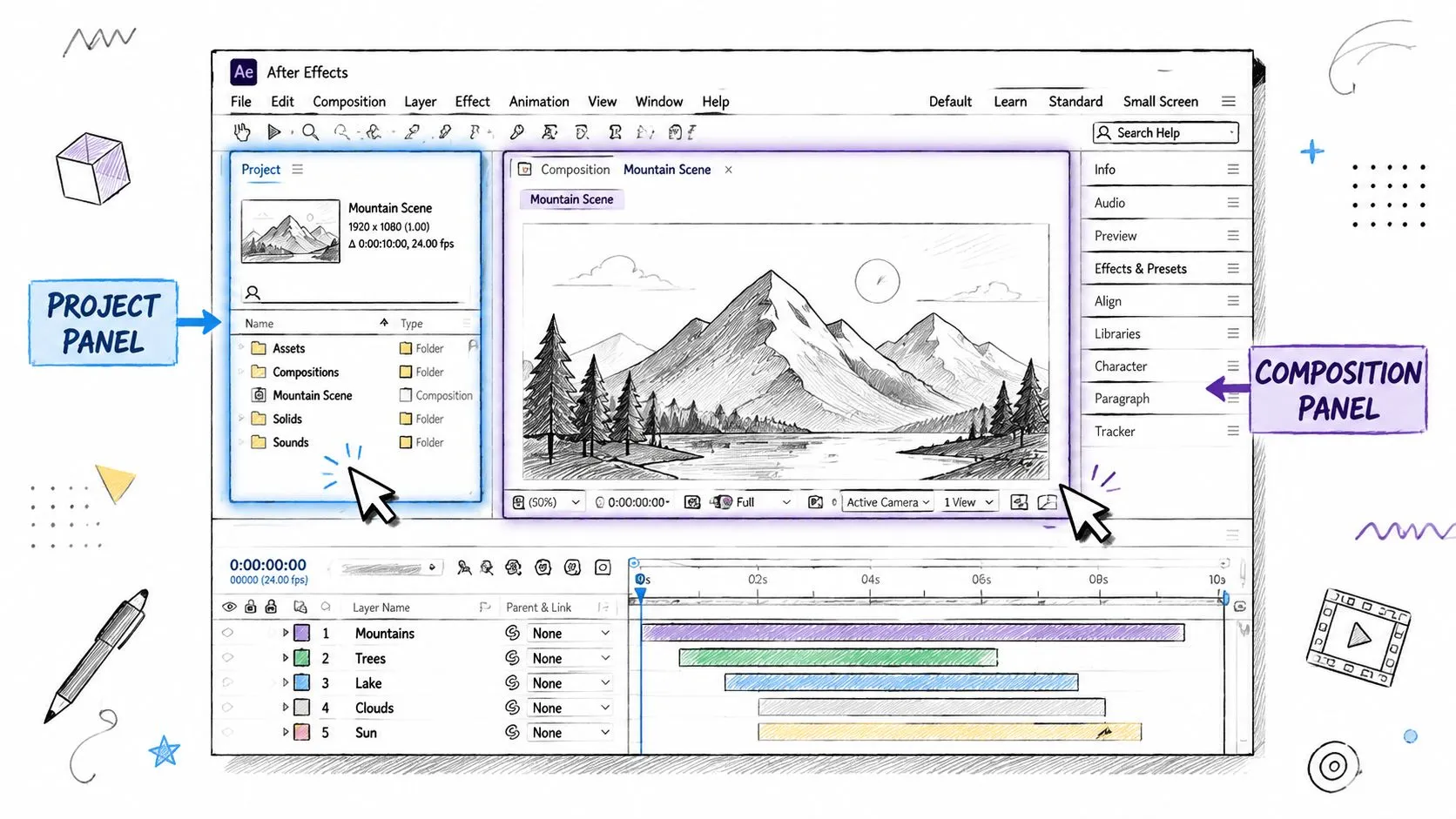
Focus on three panels first
Beginners lose time by looking at everything at once. Ignore most of the interface and get comfortable with these three areas:
- Project panel. It functions as your asset bin. Import logos, images, audio, and Illustrator files here.
- Composition panel. The current shot is visible here.
- Timeline panel. The actual animation work takes place here.
That's enough to start. Effects, tracking, and advanced panels can wait.
Practical rule: If you can't explain what a panel does in one sentence, you probably don't need it open for your first project.
Create a composition that fits a normal web video
Go to Composition > New Composition. For a straightforward marketing asset, use these settings:
| Setting | Recommended value |
|---|---|
| Frame size | 1920 x 1080 |
| Frame rate | 24 fps |
| Duration | 10 seconds |
| Background color | Any neutral placeholder |
These settings keep decisions simple. Full HD works almost everywhere. A 10-second duration gives you enough room for an intro, a main message, and an ending. And 24 fps is a comfortable frame rate for clean motion.
Name the comp something useful like Brand Intro v1 instead of leaving it as Comp 1. Naming sounds boring until you duplicate three versions and can't tell which one is current.
Organize before you animate
Import your files and sort them into folders right away. Even a tiny project gets messy fast.
A simple structure works well:
- Assets for logos, images, and audio
- Precomps if you start building nested scenes
- Final comps for export-ready timelines
If your team creates social video regularly, keeping a separate library of templates and reusable visual components helps. This collection of video and visual workflow tools is a good reference point when you want to standardize repeatable creative tasks across projects.
The biggest early win in motion graphics after effects isn't a flashy effect. It's opening the file tomorrow and still knowing where everything is.
Animating with Keyframes The Core Skill
The first real breakthrough in After Effects comes when a dead still object moves because you told it to. Not because you added a preset. Not because a plugin guessed what you meant. Because you placed two points in time and defined the change between them.
Motion graphics as a discipline grew during Hollywood's post-war golden age, and After Effects later brought that craft to a much wider audience. Today it's used for film and TV opening credits, advertising, and news broadcasting, where movement helps people explain information more clearly, as noted in this overview of motion graphics applications.
Start with one shape and one line of text
Create a new shape layer and draw a circle. Then add a text layer with a short phrase like New Product Launch. That's enough to learn the mechanics.
Now open the circle layer in the timeline and press P for Position. Move the playhead to 0:00 and click the stopwatch. That creates your first keyframe.
Move the playhead to 2 seconds. Drag the circle to a new place on the screen. After Effects creates a second keyframe automatically. Press spacebar and the circle travels between those two points.
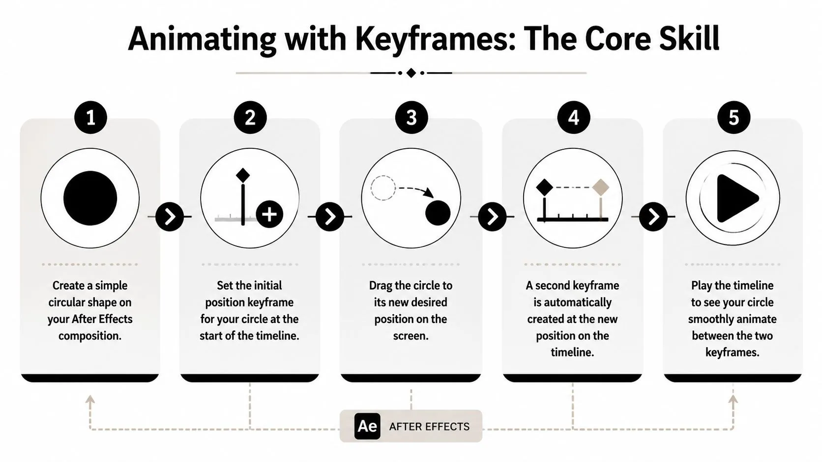
That's the core idea. A keyframe says, “At this moment, this property has this value.” Add another one later with a different value, and the software fills in the motion.
Learn the four transforms in a useful order
A lot of beginners try everything at once. It works better to animate the big four in order.
-
Position
Best for entrances, exits, and directional movement. Slide a headline upward instead of dropping it randomly from the corner. -
Scale
Good for emphasis. A callout can grow slightly as it arrives, but don't overdo it or it starts to feel like a button animation from an old website. -
Rotation
Use it when the object has a reason to turn. Icons, badges, and geometric shapes can rotate well. Body text usually shouldn't. -
Opacity This controls visibility. A fade-in often works better than having text appear.
Here's a clean exercise. Keep your circle moving from left to right. Then make the text start at 0% opacity, increase to full visibility as it arrives, and scale up gently from a slightly smaller size. You'll immediately see how motion supports hierarchy. The shape draws attention first. The text becomes readable second.
What works and what doesn't
A beginner timeline usually fails for design reasons, not software reasons.
What works
- One main action at a time so the viewer knows where to look
- Staggered entrances instead of every layer moving on the same frame
- Short distances for UI text and labels, because subtle movement feels more deliberate
What doesn't
- Everything flying in from different directions
- Large scale jumps that distort logos or type
- Animating every property on every layer just because you can
Good motion behaves like a clear presentation. It introduces one idea, then the next, then reinforces the point.
If part of your workflow still lives in Premiere Pro, this guide on how to animate text in Premiere Pro is handy for simpler edits where full After Effects control would be overkill. That's an important trade-off to learn early. Use After Effects when timing, layering, and design precision matter. Use Premiere when the job is mostly editing with light motion.
Achieving Professional Polish with Easing
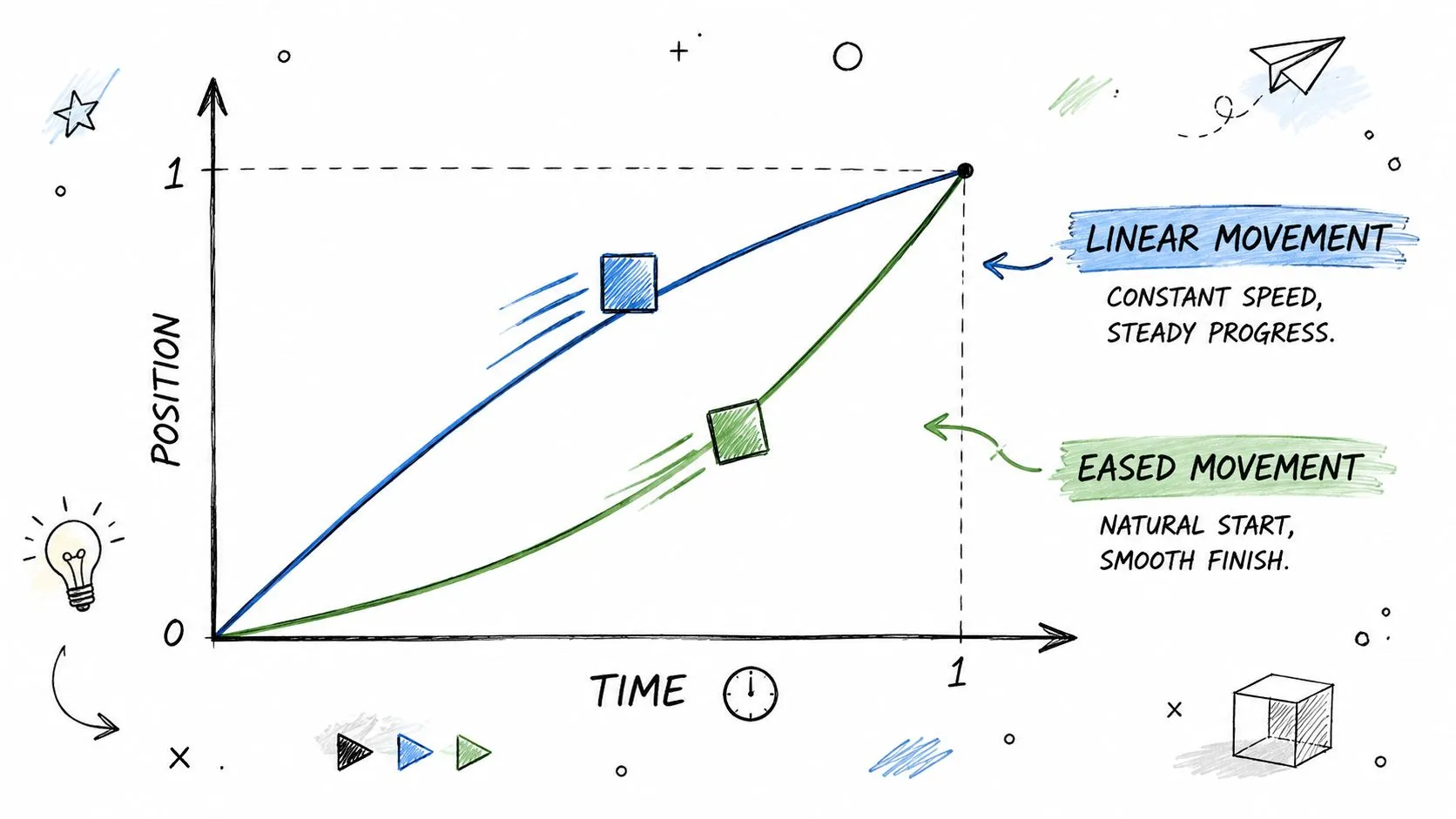
The fastest way to spot beginner animation is linear movement. The object starts at one speed, stays at that speed, and stops like it hit a wall. Real objects don't move like that, and good interface motion doesn't either.
Use Easy Ease before you do anything fancy
Select your keyframes and press F9. That applies Easy Ease. It's the quickest improvement you can make because it softens the start and end of movement.
The difference is not subtle. According to this Graph Editor and easing tutorial, using F9 and then shaping motion in the Speed Graph increased perceived smoothness by 40% in user-tested animations compared to linear interpolation, and 85% of motion designers cited the Graph Editor as the critical skill for professional-grade results.
That lines up with what happens in real project reviews. A marketer might not know the term “easing,” but they'll still say one version feels polished and another feels awkward. They're reacting to timing.
Think in terms of acceleration
A useful analogy is a car leaving a traffic light. It doesn't instantly appear at full speed. It accelerates, cruises, then slows as it approaches the next stop. Screen motion needs the same logic.
If a headline enters from the left, don't let it move at identical speed from first frame to last. Let it start gently, move faster through the middle, then settle into place. That settling moment is what gives the animation confidence.
Here's where static design principles start carrying into motion:
- Primary message gets the smoothest, clearest motion
- Supporting elements should move less or arrive later
- Decorative layers should never compete with readability
Open the Graph Editor when timing matters
Easy Ease is the shortcut. The Graph Editor is the steering wheel.
When you open it, switch to the Speed Graph and shape the curve so it starts low, climbs through the middle, and eases down at the end. That curved graph is what creates natural acceleration and deceleration.
The Graph Editor is where animation stops being “object moves from A to B” and becomes “object arrives with intent.”
A simple test helps here. Duplicate a layer. Leave one animation linear. Ease the other and shape the speed curve. Then preview both. The eased version usually looks more expensive, even though the design assets are identical.
After you've watched the difference once, this walkthrough helps make the graph feel less abstract:
Don't over-polish everything
There's a trade-off. Too much easing can make work feel floaty. Marketing graphics often need clarity more than flourish.
Use stronger easing on:
- Hero text
- Logo reveals
- Single featured icons
Use lighter easing on:
- Lists
- Charts
- Anything the viewer needs to read quickly
In motion graphics after effects, professionalism usually comes from restraint. Better timing beats more effects.
Time-Saving Workflows and Essential Effects
Once you understand keyframes and easing, the next bottleneck is time. You can build everything by hand, but you shouldn't. Good workflow means knowing when to use a preset, when to write a tiny expression, and when to leave the shot alone.
Use presets for repeatable style
Animation Presets are useful when the task is common and the look doesn't need to be invented from scratch. Text reveals, simple fades, and background movement often fit here.
Presets work best when:
- You need speed for recurring social assets
- The motion is secondary to the message
- You plan to tweak timing after application
They don't work well when:
- Brand personality needs custom pacing
- The layout is unusual
- The preset moves attention away from the main content
That's the trade-off. Presets save setup time, but generic motion still looks generic if you don't adjust it.
Use expressions for behavior
Expressions are different. A preset gives you a ready-made move. An expression creates a rule.
Adobe's expression basics documentation explains how JavaScript-based expressions automate dynamic motion. Adobe states that this can reduce keyframe creation time by 70% and that the approach is used by 80% of professional motion graphics teams.
The simplest high-value example is a subtle wiggle. Alt-click the stopwatch for Position and enter:
wiggle(5,50)
That tells the layer to move with repeated variation. It's great for adding life to a floating badge, background element, or cursor-style pointer. It's terrible for body copy or anything that must stay readable.
Workflow shortcut: Presets are best when you want a finished move quickly. Expressions are best when you want a system that keeps behaving without manual keyframes.
Pick the lighter tool first
A lot of non-technical teams jump straight to complicated setups. Don't. Ask one question first: Do I need a fixed animation or a living behavior?
Use a preset if the text should slide in once and stop. Use an expression if the object should keep drifting, pulsing, or looping.
The same logic shows up in web design tools too. If you've ever built interactive page movement, this tutorial on Elementor parallax and mouse effects is a good comparison point. The principle is similar. Some movement is prebuilt styling. Some movement responds like a system.
For teams experimenting with faster creative production and AI-assisted media workflows, tools in this Runway resource hub can also help with adjacent video tasks. That's especially useful when you need to generate or refine supporting assets before they ever reach After Effects.
Finalizing and Exporting Your Animation
A clean animation still fails if the export settings are wrong. At this point, many first projects go off track. The work looks fine in the comp viewer, then the delivered file is huge, blurry, or unusable for web upload.
Pick one export path and stick with it
After Effects gives you two common routes:
- Render Queue inside After Effects
- Adobe Media Encoder for flexible delivery formats
For most web delivery, Media Encoder is the easier option. It handles H.264 well, which gives you an MP4 file that works cleanly for websites, social posts, and internal sharing.
Export a web-ready MP4
Use this sequence:
- In After Effects, select your final composition.
- Go to Composition > Add to Adobe Media Encoder Queue.
- In Media Encoder, click the format and choose H.264.
- For preset, start with Match Source - High Bitrate.
- Choose your output location.
- Hit the green play button to render.
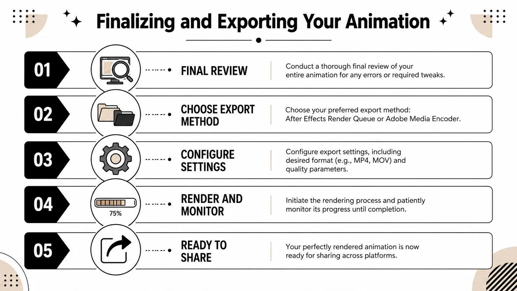
That workflow is simple on purpose. Beginners often lose time by changing too many settings they don't yet need to touch.
Before you export, check the work area, proofread every text layer, confirm logo colors, and preview the final few seconds. Exporting the wrong duration is one of the most common avoidable mistakes.
Do one final review like a client would
Don't just watch the animation as the designer. Watch it as the viewer.
Ask:
- Can I read the message on first pass
- Does the movement support the hierarchy
- Does anything feel late, abrupt, or distracting
If the file is headed to a website or landing page, a tool library like VEED-related workflow resources can be useful for checking adjacent publishing and editing needs after the render is done.
Exporting isn't glamorous, but it's part of the craft. A strong delivery file protects all the timing and design judgment you put into the comp.
Common Problems and Quick Fixes
Most “After Effects problems” in a first project aren't disasters. They're usually one hidden toggle, one wrong layer setting, or one export assumption.
Why can't I see my shape
Check the Fill and Stroke in the top toolbar. If both are set incorrectly, you may have created a shape that technically exists but isn't visible the way you expect. Also confirm the layer isn't shy, locked, or buried under another full-screen layer.
Why is preview so slow
Lower the preview resolution in the Composition panel. You don't need to preview every draft at full quality. Half or quarter resolution is often enough while you work on timing.
Why does my export have a black background
That usually comes down to format expectations. If you built with transparency in mind, make sure you export with settings that preserve the result you need. Many first-time exports look wrong because the delivery format doesn't match the intended use.
Why does the animation feel messy even when nothing is broken
This one is more important than people think. The file may be working perfectly, but the design logic isn't.
Try this quick reset:
- Reduce simultaneous motion so fewer things compete
- Delay secondary elements by a few frames
- Remove one decorative move before adding a new one
If an animation feels confusing, the fix is often subtraction, not another effect.
If you're the person on your team who keeps getting asked to make content faster, cleaner, and more adaptable, AI Academy is worth a look. It's built for working professionals, not full-time engineers, and it focuses on short, practical tutorials for tools like ChatGPT, Claude, Midjourney, Perplexity, and many other AI workflows you can apply directly to content, research, reporting, and production.