Correlation in statistics is a number that ranges from -1 to 1, and it tells you how closely two variables move together. A value near 1 means they rise together, a value near -1 means one rises while the other falls, and a value near 0 means there isn't a clear linear pattern.
You're probably here because you have two columns in a spreadsheet and a practical question, not a textbook question. Maybe ad spend and leads. Maybe customer satisfaction scores and renewal likelihood. Maybe employee training hours and performance ratings. You want to know whether the pattern you think you see is real enough to trust.
Correlation is a statistical measure that expresses the extent to which two variables are linearly related, meaning they change together at a constant rate. That sounds technical, but the working idea is simple: correlation helps you tell whether two things tend to move together, in opposite directions, or not in any consistent way.
Where most beginner explanations fall short is right after they tell you that correlation runs from -1 to 1 and that correlation isn't causation. That's true, but it doesn't answer the question professionals usually have at work: which kind of correlation should I use with messy data like survey ratings, rankings, or non-linear relationships? That choice matters more than many basic guides admit.
What Is Correlation An Introduction for Professionals
A marketing manager opens a dashboard and sees two lines moving up together. Website traffic is rising. So is ad spend. The first instinct is to say, “Great, spend is driving traffic.”
That might be true. It might also be only partly true. Correlation is the tool you use to describe that pattern before you jump to a bigger conclusion.
Correlation measures how two variables move in relation to each other. If they tend to increase together, that's a positive correlation. If one tends to go up while the other goes down, that's a negative correlation. If the pattern is messy or inconsistent, the correlation is weak or absent.
Why this matters at work
Business data rarely arrives in a neat research format. You're dealing with campaign results, customer ratings, lead scores, survey responses, and funnel stages. In that setting, correlation is useful because it gives you a fast way to test whether a pattern is worth paying attention to.
For non-technical teams, the more important question usually isn't “what is correlation in statistics” as a definition. It's this: what decision does this help me make?
A few examples:
- Budget planning: Are higher spend periods associated with more conversions?
- Customer research: Do higher satisfaction ratings line up with better retention?
- Sales operations: Does faster lead follow-up tend to coincide with more closed deals?
- People analytics: Do training hours track with stronger review scores?
Correlation is often the start of a good decision, not the end of one.
If you work with spreadsheets, dashboards, or reporting tools, learning correlation will make your judgment sharper. If you want to build that skill further, this AI path for data analysts is useful for turning spreadsheet questions into repeatable analysis workflows.
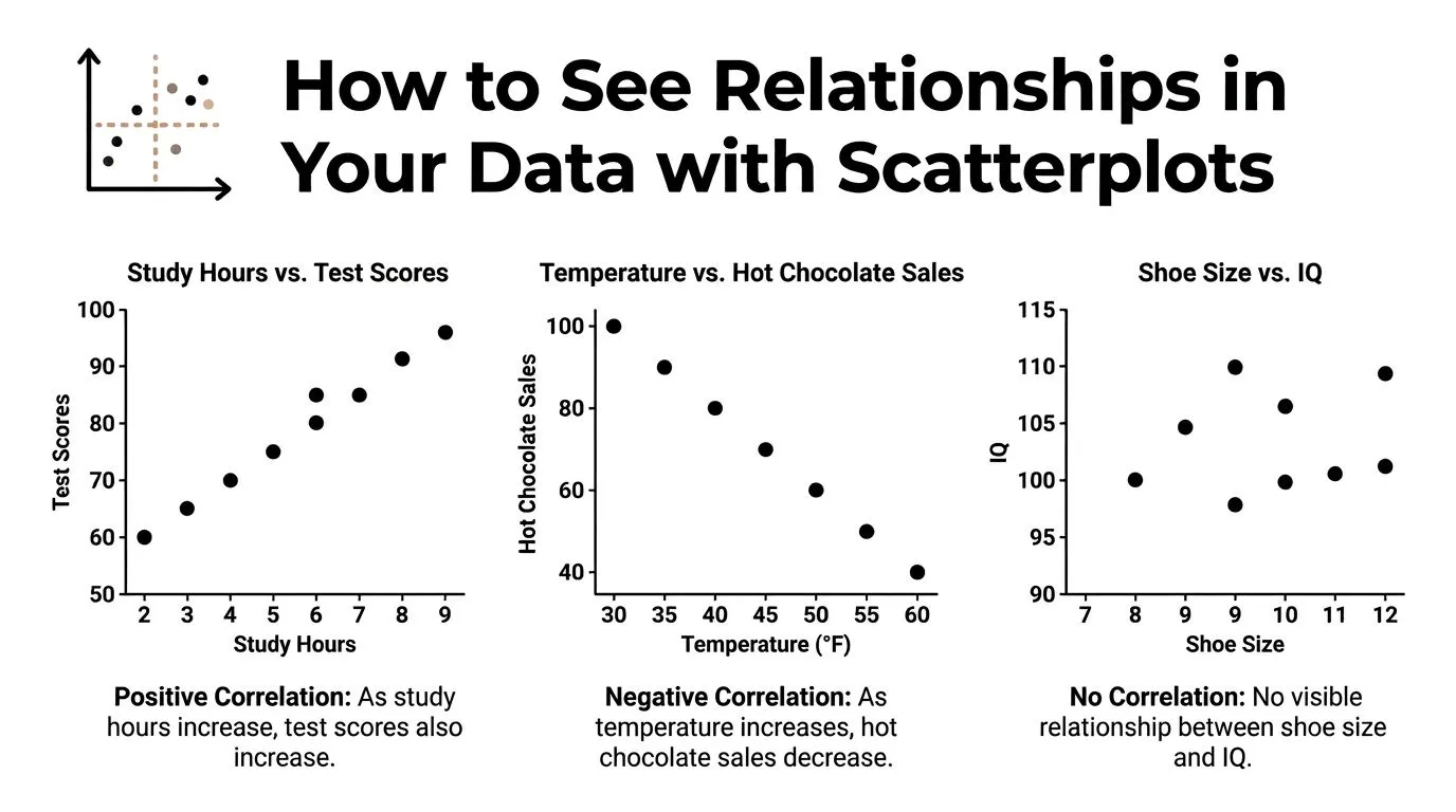
How to See Relationships in Your Data with Scatterplots
Before you calculate anything, look at the data.
A scatterplot is the fastest way to see whether two variables have a relationship worth measuring. One variable goes on the horizontal axis. The other goes on the vertical axis. Each dot represents one observation, such as a customer, campaign, month, or employee.
If the dots form an upward slope, the variables usually rise together. If they slope downward, one tends to fall as the other rises. If the dots look like random confetti, there may be no clear relationship.
The three patterns to spot first
Most workplace scatterplots fall into one of three basic shapes.
- Positive correlation: As one variable increases, the other usually increases too. Think of training hours and performance score if more training tends to help people do better.
- Negative correlation: As one variable increases, the other usually decreases. Think of product price and units sold in a price-sensitive market.
- No clear correlation: The dots don't form a reliable direction. You might be comparing two things that don't move together in a useful way.
What your eyes catch before the formula does
A scatterplot does something a single number can't. It shows whether the pattern is shaped like a straight line.
That matters because many people jump straight to a correlation formula and miss obvious problems:
- Outliers: One unusual month can distort the result.
- Clusters: Two customer segments may behave differently.
- Curves: The relationship may exist, but not as a straight line.
- Ceiling effects: Survey scores often bunch up at the high end.
Practical rule: If you haven't looked at a scatterplot, you don't yet know whether your correlation number is trustworthy.
A marketer comparing “emails sent” and “unsubscribes” might expect a simple positive pattern. But a scatterplot could reveal that unsubscribes only rise sharply after email volume crosses a certain threshold. That's a very different business story from a steady linear trend.
If you want to get more fluent at reading charts like this, the course on visualizing data in minutes is a practical next step.
Measuring Correlation The Meaning of the R-Value
A scatterplot gives you the visual pattern. The correlation coefficient, written as r, gives you a compact summary of that pattern.
The r-value runs from -1 to 1, and it answers two practical questions at once. Which direction do the variables move? And how consistently do they move together in a straight-line pattern? If you are comparing campaign spend with leads, or training hours with sales performance, that single number helps you judge whether the relationship looks strong enough to matter in business decisions.
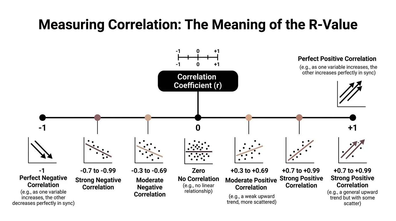
What the sign tells you
Start with the sign.
- A positive r means the variables tend to rise or fall together.
- A negative r means one tends to rise while the other falls.
- An r near 0 means there is little linear relationship.
That last point causes a lot of confusion. An r near zero does not always mean the variables have nothing to do with each other. It can mean the relationship is curved, segmented, or shaped by thresholds instead of a straight line. A marketing manager might see little correlation between email volume and conversions overall, even though conversions rise up to a point and then flatten.
What the size tells you
The absolute value of r tells you the strength. In plain terms, it shows how tightly the dots cluster around a straight trend.
A simple way to read it is like a volume knob. Values closer to 1 or -1 mean a clearer, more dependable straight-line relationship. Values closer to 0 mean more noise and less predictability.
Here is the plain-English version:
| R-value pattern | What it usually means in plain English |
|---|---|
| Near +1 | As one rises, the other also rises in a very consistent way |
| Near -1 | As one rises, the other falls in a very consistent way |
| Near 0 | No clear straight-line pattern |
Context matters here. A “strong” correlation in one field may be ordinary in another. In marketing, customer behavior is messy, so a moderate correlation can still be useful if it helps you choose between campaigns, audiences, or product changes.
One more point matters for professionals working with real-world data. The r-value people quote most often is Pearson's r, and Pearson is built for straight-line relationships between numeric variables. If your data is made of rankings, survey ratings, or ordered scales, the right method may be different, which affects how you should read the number in the first place. For readers who regularly report findings to teams or clients, this guide to interpreting statistical data for researchers is a useful companion for turning statistical output into careful business interpretation.
Choosing the Right Method Pearson vs Spearman
A marketing manager might ask a simple question: “We surveyed customers on a 1 to 5 satisfaction scale, and we also ranked leads by sales priority. Can we use correlation for both?”
Yes, but not with the same method every time.
That is the part many beginner explanations miss. In day-to-day business analysis, the choice between Pearson and Spearman changes what your result means. If you use the wrong one, you can end up reporting a weak relationship that is fairly consistent, or a precise-looking number that does not fit the kind of data you collected.
Pearson is for straight-line numeric relationships
Use Pearson correlation when both variables are numeric and the gaps between values are meaningful.
Good examples include:
- Monthly ad spend and monthly revenue
- Discount percentage and conversion rate
- Page load time in seconds and bounce rate
Pearson works like measuring distance with a ruler. It uses the actual values, so the difference between 10 and 20 matters in a numeric way, not just as “higher” versus “lower.”
It is usually the right choice when your scatterplot shows a roughly straight upward or downward trend. If each step up in one variable tends to line up with a fairly proportional step in the other, Pearson fits that pattern well.
Spearman is for ranks, ratings, and uneven but consistent movement
Use Spearman correlation when the order matters more than the exact spacing between values.
That often makes more sense for:
- Survey ratings such as 1 to 5 satisfaction scores
- Net promoter style response scales
- Ranked lists, such as lead quality from highest to lowest
- Priority scores created by a team rule, not a true measurement scale
Spearman works more like comparing positions in a race than measuring the exact distance between runners. It asks whether higher values in one variable tend to line up with higher values in the other, even if the jumps are uneven.
That matters in real business data. A move from a 1-star experience to a 2-star experience may reflect a much bigger practical change than a move from 4 stars to 5 stars. Pearson treats those gaps as equal. Spearman does not depend on that assumption in the same way.
A simple way to choose
Start with the kind of data you have, then look at the pattern.
| Criterion | Pearson Correlation | Spearman Correlation |
|---|---|---|
| Best for | Numeric variables with meaningful intervals | Ordinal, ranked, or rating-scale data |
| Relationship shape | Straight-line pattern | Consistent upward or downward pattern |
| Uses | Raw values | Ranks |
| Good fit for survey scales | Sometimes, with caution | Often |
| Sensitive to uneven spacing | Yes | Less |
A quick rule of thumb helps:
- Choose Pearson for measured numeric data with a roughly linear relationship.
- Choose Spearman for rankings, ordered scales, or data that rises and falls consistently without forming a clear straight line.
Here is a practical example. Suppose you want to compare customer satisfaction score and renewal likelihood. If satisfaction is collected on a 1 to 5 scale, Spearman is often the safer choice because those numbers are ordered categories, not precise measurements. If you are comparing ad spend in dollars to sales in dollars, Pearson is usually the better fit.
The method should match the data you have. That is what makes correlation useful at work, instead of just technically correct.
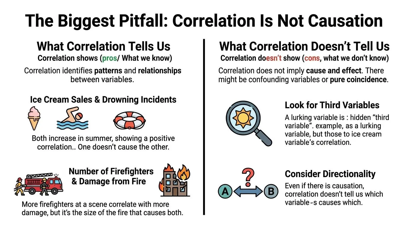
The Biggest Pitfall Correlation Is Not Causation
You've probably heard the phrase before. The problem is that individuals often hear it, nod, and then ignore it the minute a chart seems to confirm their opinion.
Correlation means two variables move together. It does not prove that one causes the other.
What a correlation can and cannot tell you
Two things can be correlated for several reasons:
- One may influence the other
- The second may influence the first
- A third variable may influence both
- The pattern may be coincidental
The classic example is ice cream sales and drowning incidents. They can rise at the same time, but ice cream doesn't cause drowning. Hot weather increases both.
At work, the same mistake happens constantly. A team may notice that content output and inbound leads rise together. They conclude that publishing more content caused the lead growth. Maybe. But maybe seasonality, paid promotion, brand awareness, or a product launch pushed both.
Later in your analysis, a visual explanation can help reset the conversation before stakeholders overread the numbers.
Correlation is a clue. Causation is a claim. Those are not the same thing.
A quick causation checklist for work decisions
Before you tell a team that X caused Y, ask these questions:
-
Could a third factor explain both?
Seasonality, team size, product changes, pricing, and audience mix often create false certainty. -
Which direction makes sense?
Higher customer satisfaction might support retention, but retention could also improve satisfaction because long-term customers learn the product better. -
Did something else change at the same time?
A campaign relaunch, new landing page, or sales process update can muddy the story. -
Would an experiment be possible?
If you can run an A/B test, holdout test, or pilot, you can move closer to a causal answer.
When you present correlations to a manager, your wording matters. Say “associated with,” “moves with,” or “linked to.” Save words like “drives” or “causes” for situations where you tested causality.
How to Calculate Correlation in Excel Google Sheets and AI Tools
Once you understand the pattern and choose the method, calculating correlation is straightforward.
For many workplace tasks, you'll use Excel, Google Sheets, or an AI assistant that can inspect a file and run the calculation for you.
Excel and Google Sheets formula
For a standard spreadsheet workflow, the formula is:
=CORREL(array1, array2)
In plain language, you select one range for the first variable and one matching range for the second.
Example:
- Column A = Monthly Ad Spend
- Column B = New Customers
You'd enter:
=CORREL(A2:A13, B2:B13)
A few rules matter:
- Use matching rows: Each row should describe the same unit, such as the same month or customer.
- Remove headers from the formula range: Start from the first data row.
- Watch missing values: Blank cells can create messy results if the ranges no longer line up.
A useful prompt for AI tools
If you use ChatGPT with Advanced Data Analysis, Claude, or a spreadsheet-focused AI tool, you can ask for both the number and the visual.
Try a prompt like this:
“I have an Excel file with columns named Monthly Ad Spend and New Customers. Calculate the Pearson correlation between these columns, create a scatterplot, and tell me whether the relationship looks linear enough for Pearson to make sense.”
If your data is based on rankings or survey scales, change the request:
“My file includes Customer Satisfaction Score and Product Rating on ordered scales. Check whether Spearman correlation is more appropriate than Pearson, calculate it, and explain the result in plain English.”
If you want to go further with spreadsheet workflows, this guide on automating Excel data analysis is useful for moving from manual formulas to faster analysis support.
Common mistakes before you calculate
People usually get the formula right. They get the setup wrong.
- Mixed data types: Don't combine text labels and numeric values in the same analysis range.
- Ordinal data treated as perfectly numeric: A satisfaction scale may call for Spearman rather than Pearson.
- Aggregated data hiding detail: Monthly averages can hide customer-level variation.
- No visual check: A curved relationship can make the raw correlation misleading.
If you spend a lot of time in spreadsheets and want practical AI help for everyday analysis, this learning path for AI tools for Excel users is worth exploring.
Frequently Asked Questions About Correlation
What counts as a strong correlation
There isn't one universal cutoff that works in every field. What counts as “strong” depends on the context, the quality of the data, and the decision you need to make.
In practice, don't ask only whether a correlation looks strong. Ask whether it's consistent, plausible, and useful.
What is the difference between correlation and regression
Correlation tells you whether two variables move together and in which direction.
Regression goes further. It fits a line or model so you can estimate how one variable changes as another changes. If correlation helps you describe association, regression helps you model and sometimes predict.
Can a correlation of zero still hide a relationship
Yes. A correlation near zero can still happen when there's a relationship that isn't linear.
That's one reason scatterplots matter. The dots may form a curve, a step pattern, or separate clusters even when the linear correlation looks weak.
Is Pearson always the default
It's the common default, but it shouldn't be automatic. Pearson fits linear relationships between quantitative variables. Spearman is often better for ranked data, ordinal scales, and relationships that move in one direction without following a straight line.
Can I use correlation with survey data
Often yes, but you need to think carefully about the type of survey data. Ordered response scales frequently push analysts toward Spearman rather than Pearson. That choice affects the meaning of the result.
Should I make decisions from correlation alone
Usually not. Correlation is a strong screening tool. It helps you spot patterns, prioritize questions, and challenge assumptions. For high-stakes decisions, pair it with domain knowledge, segmentation, experiments, or follow-up analysis.
If you want to get better at questions like this without sitting through bloated theory-heavy courses, AI Academy is a practical place to learn. It focuses on fast, job-relevant lessons for professionals who want to use tools like ChatGPT, Claude, Perplexity, and spreadsheet AI to analyze data, automate reporting, and make stronger decisions at work.