Normalizing data is the process of rescaling numeric data from different columns to a common scale, typically between 0 and 1, without distorting the range of values or losing information. If you're asking what normalizing data is, the short answer is this: it helps you compare values fairly when they start in different units or ranges.
You've probably run into this without calling it “normalization.” Maybe you're looking at campaign spend, lead scores, customer ratings, and revenue in the same sheet. One column has small numbers, another has huge ones, and side-by-side comparison starts to feel misleading.
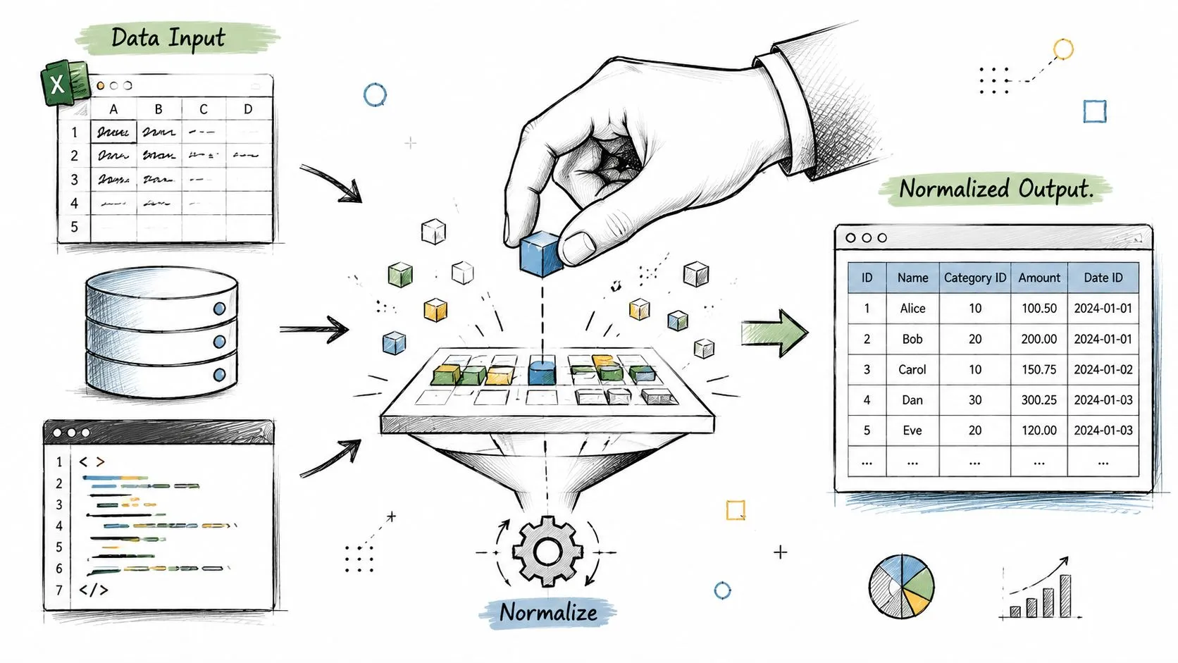
That's where people often get stuck. They hear “normalize your data” and assume it means one universal process. It doesn't. Sometimes it means scaling numbers for analysis or machine learning. Other times it means restructuring database tables to reduce duplication. Those are related only by name, and mixing them up causes a lot of beginner confusion.
If your work touches spreadsheets, dashboards, AI models, or imported records from forms and PDFs, this idea shows up fast. Teams building cleaner inputs for reporting often combine scaling with upstream cleanup, especially when using AI-powered document processing automation to turn messy source files into usable fields. If you want a broader practical path into this kind of work, the AI for data analysts learning path is a useful place to build those habits.
What Is Data Normalization in Simple Terms
Say you're comparing two customer columns in a spreadsheet: lifetime value and satisfaction score. Lifetime value might be in the thousands, while satisfaction sits on a small rating scale. If you compare them as-is, the larger numbers can overpower the smaller ones, even if both matter.
That's why people normalize data. You keep the meaning, but you change the scale so the columns can sit on equal footing. It's a lot like converting prices from different currencies into one currency before deciding what's expensive.
A recipe analogy works too. If one ingredient is listed in cups and another in grams, you can still cook, but comparison gets messy. Once everything uses a common measurement logic, the recipe becomes easier to judge and combine.
Practical rule: Normalization changes how values are expressed, not what the values represent.
In plain language, normalizing data means taking values from different numeric columns and putting them onto a common scale so analysis is fairer and cleaner. That matters in dashboards, scoring models, segmentation work, and machine learning.
A lot of confusion comes from the phrase itself. People search “what is normalizing data” and get mixed answers because the term is used in more than one field. In this article, the main focus is the analytics and AI meaning: scaling numeric values so one feature doesn't shout louder just because it uses bigger numbers.
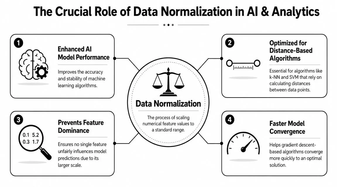
Why Normalizing Data Matters for AI and Analytics
Some algorithms treat numeric distance as meaningful. If one feature ranges widely and another stays small, the wide one can dominate the math. The model may act as if that feature matters more, even when it doesn't.
Think of a GPS that treats one mile and one foot as equal steps in a route calculation. The path would be distorted from the start. That's what uneven scales can do inside a model.
When scale quietly distorts results
Distance-based methods are especially sensitive. If you're grouping customers, comparing similarity, or building a model that relies on closeness between points, raw scale can pull the outcome off course.
That's also why data prep matters before the model stage. If you're pulling values from invoices, forms, exported reports, or semi-structured records, it helps to first automate data extraction workflow so the fields are consistently captured before you scale them. Clean extraction and normalization solve different problems, but they work well together.
Here's what normalization helps with in practice:
- Fairer feature comparison: A large-range column won't drown out a small-range one.
- Cleaner model behavior: Some algorithms handle training more smoothly when inputs share a similar scale.
- Easier interpretation: Looking at several features side by side becomes less visually deceptive.
- Better preprocessing discipline: It forces you to inspect distributions, units, and outliers before modeling.
Data with mismatched scales often looks fine to a person and behaves badly in a model.
The database meaning versus the machine learning meaning
Here's the distinction most beginner guides miss. According to Splunk's explanation of data normalization, “normalizing data” means different things in database design versus machine learning/statistics. In databases, normalization is about structuring tables to reduce redundancy and anomalies. In machine learning, it's about scaling numeric features to comparable ranges for model performance. Splunk also notes that this difference matters because database normalization follows normal forms such as 1NF–5NF, while machine learning normalization may use linear scaling, z-score scaling, log scaling, or clipping depending on distribution and outliers.
That's a big deal because the action you take depends on the problem you have. If your customer table repeats the same company details in every row, you're dealing with database structure. If your model is comparing age, spend, and engagement score on wildly different numeric scales, you're dealing with feature scaling.
People often use the same word for both and end up applying the wrong fix. A cleaner database schema won't automatically prepare model features. And scaling columns won't fix duplicate or poorly structured tables.
Common Data Normalization Methods Explained
Not every dataset needs the same treatment. Some columns respond well to a simple rescaling to a fixed range. Others work better when you center them around their average spread.
If you work with spreadsheet data and relational data together, it helps to understand both the scaling methods here and the logic of connecting data in relational databases, because structure problems and scale problems often show up in the same workflow. For hands-on prep practice, this data cleaning and formatting course complements the mechanics well.
Min-max scaling
This is often the method implied when “normalize” is mentioned. It takes the smallest value in a column and maps it to 0, the largest value and maps it to 1, then places everything else somewhere in between.
Formula:
(value - minimum) / (maximum - minimum)
Plain-English intuition: it squishes your data into a fixed range. If one value sits halfway between the minimum and maximum, its normalized value will also sit about halfway between 0 and 1.
Use min-max scaling when:
- You want bounded values: The output stays in a predictable range.
- You need visual comparability: Charts and composite scores become easier to read.
- Your algorithm expects similar input ranges: This often helps with models sensitive to feature scale.
The catch is outliers. If one extreme value stretches the range, most of the other values can get compressed into a narrow band.
Z-score standardization
This method doesn't force values into a 0-to-1 range. Instead, it describes how far each value is from the column's center, measured in standard deviations.
Formula:
(value - mean) / standard deviation
Plain-English intuition: instead of asking “where is this value between the min and max?”, it asks “how unusual is this value compared with the rest of the column?”
Use z-score standardization when:
- The spread matters more than strict bounds: You care about relative distance from typical values.
- You want a centered scale: Values above the mean become positive, below the mean become negative.
- You're working with data where min and max aren't stable: This can be more informative than forcing everything between 0 and 1.
It's still affected by outliers, but in a different way than min-max scaling. It often gives you a more analysis-friendly view when the overall distribution matters.
Other scaling choices you may see
Earlier, the Splunk source noted a few additional options used in machine learning contexts. You may come across:
- Linear scaling: A broad label for proportional rescaling.
- Log scaling: Useful when values are heavily skewed.
- Clipping: Trims or caps extremes before or during scaling.
These aren't “better” by default. They fit specific data shapes and business questions.
| Method | Output Range | Key Use Case | Sensitivity to Outliers |
|---|---|---|---|
| Min-max normalization | Usually 0 to 1 | Comparing features on a shared bounded scale | High |
| Z-score standardization | Unbounded | Centering data around typical spread | Moderate to high |
| Log scaling | Depends on transform | Skewed numeric data | Can reduce outlier impact |
| Clipping plus scaling | Depends on setup | Data with extreme edge values | Lower after clipping |
Choose the method based on the shape of the data, not the popularity of the formula.
Before and After A Normalization Example
A small example makes this easier to trust. Suppose you have employee salary data in raw dollar amounts. The values are all valid, but they sit on a scale that's hard to compare neatly with other features.
What the raw values look like
Before normalization, the salary numbers differ in their original units and magnitudes. If you plotted them next to smaller-scale fields, salary would visually dominate the chart.
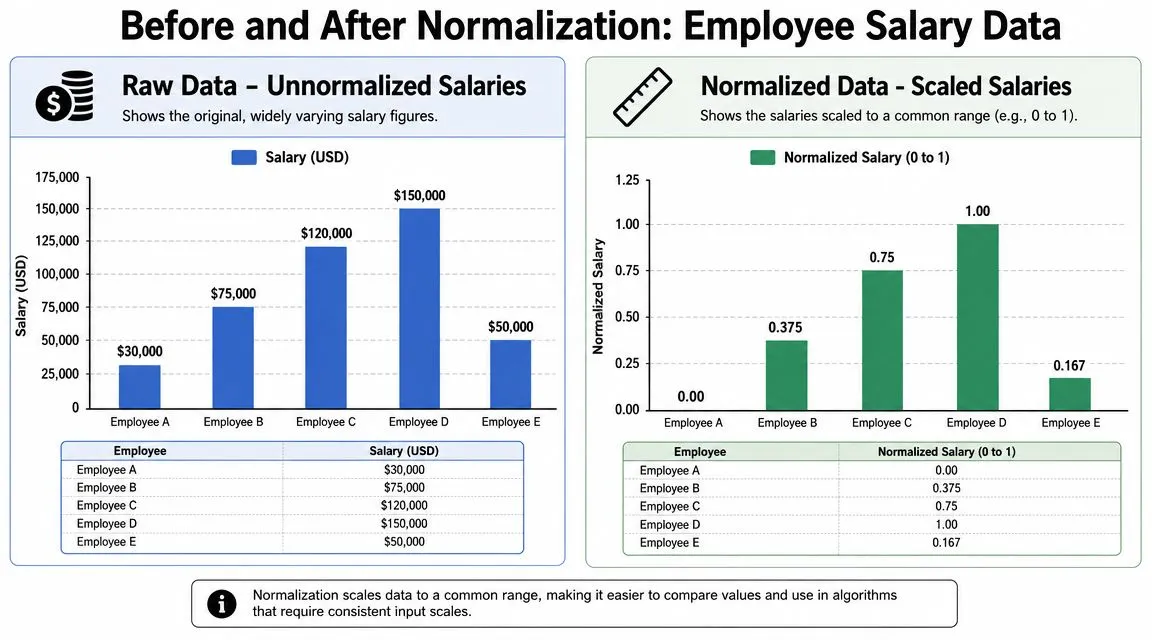
In the raw version, the gap between employees is expressed in dollars. That's useful when payroll is the question. It's less useful when salary is just one feature among many.
What changes after scaling
After min-max normalization, the smallest salary becomes 0.00 and the largest becomes 1.00. The values in between are placed proportionally on that shared scale.
Here's the same example in simple form:
- Employee A: raw salary at the minimum becomes 0.00
- Employee B: falls between the minimum and maximum, so it becomes 0.375
- Employee C: scales to 0.75
- Employee D: the maximum becomes 1.00
- Employee E: scales to 0.167
Nothing about the order changed. The highest salary is still highest, and the lowest is still lowest. What changed is the unit. You're no longer looking at dollars. You're looking at relative position within the column's range.
That's the key mental shift. Normalization doesn't erase meaning. It converts the column into a format that's easier to compare with other numeric features.
How to Normalize Data in Your Favorite Tools
You don't need a data science team to do this. You can normalize data in Excel, Google Sheets, or Python with a few repeatable steps.
Excel and Google Sheets
Assume your values are in cells A2:A10. In a new column, enter this min-max formula for the first row:
=(A2-MIN($A$2:$A$10))/(MAX($A$2:$A$10)-MIN($A$2:$A$10))
Then fill it down.
That formula does three things:
- Finds the column minimum
- Finds the column maximum
- Calculates each row's position within that range
A few practical habits help:
- Lock the range references: Use
$so the min and max range doesn't shift when you drag the formula. - Use a new column: Keep the original data intact for audits and sanity checks.
- Label clearly: Names like
Score_Normalizedbeat vague headers likeNew Value.
If you're using AI to build spreadsheet formulas faster, this ChatGPT prompts for Excel resource can save time when you want a formula adapted to your exact column layout.
Python with pandas and scikit-learn
If you're comfortable with lightweight code, Python makes normalization reusable.
import pandas as pd
from sklearn.preprocessing import MinMaxScaler

# sample data
df = pd.DataFrame({
    "spend": [120, 300, 180, 450],
    "score": [2, 5, 3, 4]
})

# choose columns to normalize
cols = ["spend", "score"]

# create scaler and transform selected columns
scaler = MinMaxScaler()
df[cols] = scaler.fit_transform(df[cols])

print(df)
This approach is useful when you're processing repeated datasets, building notebooks, or preparing features before modeling.
A simple workflow looks like this:
- Load the data: Read from CSV, Excel, or a database export.
- Select only numeric columns you want to scale: Don't blindly normalize IDs or labels.
- Apply the scaler: Replace the original columns or create new ones.
- Review the output: Check whether the transformed values match your expectations.
Keep a copy of the raw data. Normalized values are useful for analysis, but the original units still matter for explanation.
Common Pitfalls and When to Avoid Normalization
Normalization is helpful, but it isn't mandatory in every project. Some models and business questions don't benefit much from it.
Cases where you may skip it
Tree-based methods often care more about split points than shared scale. If a model is making decisions based on thresholds within each feature, raw scale may matter less than it does for distance-based methods.
You might also skip normalization when the original unit is the point. If you're building a business report for finance or operations, converting every value to a relative scale can make the output harder to interpret.
A few cases where caution makes sense:
- Decision-focused reporting: Raw dollars, hours, or units may be clearer for stakeholders.
- Already comparable features: If the columns already share similar ranges and meaning, extra scaling may add little value.
- Tree-based modeling workflows: Some algorithms are less sensitive to feature scale.
Mistakes that create bad analysis
One common error is normalizing everything without thinking about column type. Customer IDs, order numbers, and ZIP codes may be numeric in format but not numeric in meaning.
Another mistake is data leakage. If you compute scaling values using the full dataset before separating training and testing data, the test set subtly influences the transformation. That makes evaluation less trustworthy.
The safer habit is simple: fit your scaling logic on training data, then apply that same transformation to test data.
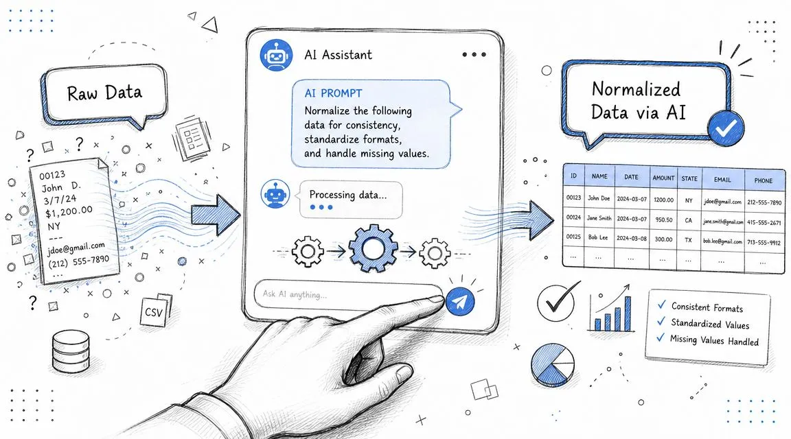
Automate Normalization with AI Prompts
If you do this often, let AI write the first draft of the formula or code. The trick is asking for something specific enough to be reusable.
Try a prompt like this for Python:
Write Python code using pandas and scikit-learn to min-max normalize selected numeric columns in a dataframe. Create a reusable function that accepts a dataframe and a list of column names, returns a new dataframe, preserves the original columns, and adds new columns with a
_normalizedsuffix. Include comments and a small example.
For Excel or Google Sheets, try this version:
Create an Excel and Google Sheets formula to min-max normalize values in column A, using rows 2 through 100. Explain how to lock the range references and how to fill the formula down the column.
These prompts save time because they turn a concept into an immediate working draft. You still need to review the result, but you don't need to start from a blank page.
If you want practical, copy-paste AI workflows for spreadsheets, reporting, analysis, and automation, AI Academy is a strong next step. It's built for working professionals who want short lessons, useful prompt templates, and clear ways to apply tools like ChatGPT in real tasks instead of getting buried in theory.