Your manager sends a message at 4:12 p.m. “Can you put together a quick presentation for tomorrow?”
Your stomach drops. You're not just thinking about slides. You're thinking about standing in front of people, sounding smart, answering questions, and somehow turning scattered notes into something clear.
That reaction is normal. Most professionals weren't taught presentation fundamentals in a practical way. They learned by watching other people, copying old decks, and hoping it would all hold together in the room.
The good news is that a presentation isn't a mysterious talent. It's a learnable communication skill. Once you understand what a presentation is, how it works, and how to build one with a simple process, the task gets much less intimidating.
More Than Slides What a Presentation Really Is
A presentation is more than a file in PowerPoint or Google Slides. It's a structured talk designed to help a specific audience understand something, decide something, or do something.
That matters because many people ask “what is a presentation” and then get stuck on the wrong detail. They focus on fonts, templates, animations, or whether they're “good at public speaking.” Those things matter far less than the core job: moving an audience from confusion to clarity.
The word itself points in that direction. The term comes from the Latin praesentātiō, meaning “the action of placing before” or “showing”, and modern presentation guidance still defines it as a structured talk with an introduction, main body, conclusion, and Q&A. That same guidance notes that audience attention often drops after about 20 minutes, which is why many effective presentations land in the 15 to 30 minute range for focused communication in professional settings, as explained in this presentation definition overview.
A presentation is not a performance where you prove your brilliance. It's a service you provide to the audience.
Think about a product manager giving a roadmap update, a marketer sharing campaign findings, or a team lead explaining a new process. The format may differ, but the purpose is the same. They're helping other people see what matters.
That's why presentations shape careers. When you can explain complex ideas clearly, people trust you with bigger decisions. A “quick deck” often becomes a moment where colleagues decide whether you're clear-headed, prepared, and credible.
The Core Anatomy of Any Great Presentation
Strong presentations feel natural when you're watching them. Under the surface, they're built on a simple structure.
A useful way to think about it is story architecture. Good stories have a setup, development, resolution, and a moment where people can respond. Presentations work the same way.
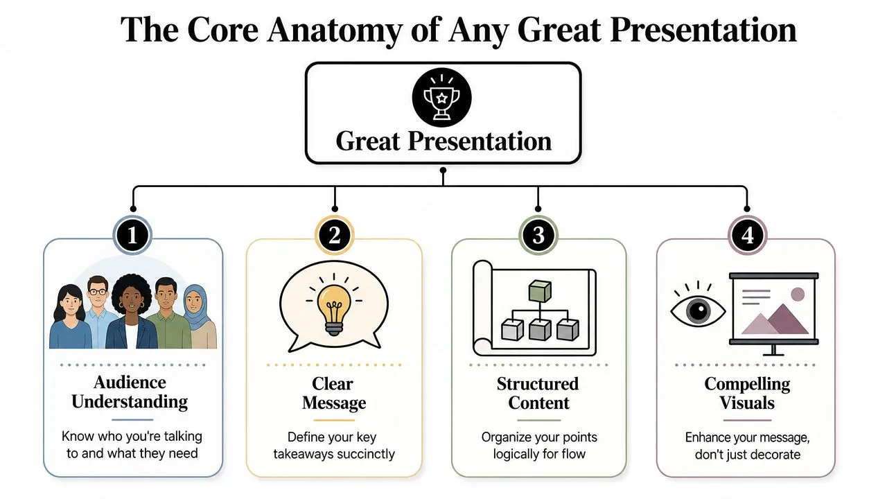
Why structure matters
When a talk feels scattered, the audience has to do extra mental work. They start asking themselves basic questions. What is this about? Why should I care? Where is this going?
A clean structure removes that friction. It gives people a path to follow.
Here's the simplest way to remember it:
| Part | Main job | What the audience needs |
|---|---|---|
| Introduction | Open the topic and orient the room | Why this matters |
| Main body | Build the case or explain the idea | Evidence, logic, examples |
| Conclusion | Lock in the takeaway | What to remember |
| Q&A | Turn the talk into a conversation | Clarification and trust |
The four parts and what each one does
Introduction
The opening earns attention. It shouldn't be a slow warm-up full of apology, biography, or throat-clearing.
A good introduction does three things quickly:
- Names the topic: Tell people what they're about to hear.
- Frames the relevance: Explain why it matters to this audience.
- Sets the direction: Give them a map so they know what's coming.
If you're presenting quarterly results, don't begin with slide after slide of context. Start with the central message. “Revenue grew in one segment, stalled in another, and today I'll show what's driving the difference.”
Main body
At this stage, many presentations either become persuasive or collapse into clutter.
The body should move point by point, not thought by thought. That sounds small, but it changes everything. A point is a clear idea. A thought is just whatever happens to be in your notes.
Use a sequence people can follow. Problem, evidence, implication. Or current state, challenge, recommendation. Or question, answer, next step.
Practical rule: If one slide tries to do three jobs, split it.
For technical presentations, the standard is even stricter. Guidance from MIT's communication resources defines a technical presentation by a cause-effect flow. The first slide should state the motivating problem and the research purpose, while later slides should use visuals and keywords, not text blocks, to support one point at a time, as described in this technical presentation guide from MIT.
Conclusion
Many presenters fade out instead of finishing strong. They say, “So yeah, that's it,” and click to a blank slide.
Your conclusion should do the opposite. Bring people back to the core message and tell them what it means. If the audience forgets most details, what's the one thing you want left in their mind?
A strong ending often includes:
- A summary: Restate the central idea in plain words.
- A decision or action: Say what should happen next.
- A memorable final line: End with confidence, not a shrug.
Q&A
Q&A isn't a test you survive. It's part of the presentation.
Questions show what landed, what didn't, and what matters most to the audience. A calm, thoughtful answer often builds more credibility than the polished slides did.
When you don't know an answer, say so clearly and offer the next step. People trust honesty more than improvisation disguised as certainty.
Key Presentation Types and Their Purpose
One reason presentations feel hard is that people use the same format for very different jobs. A training session isn't built like a sales pitch. A project update shouldn't sound like a keynote.
Your first decision isn't “What slides should I make?” It's “What kind of presentation am I giving?”
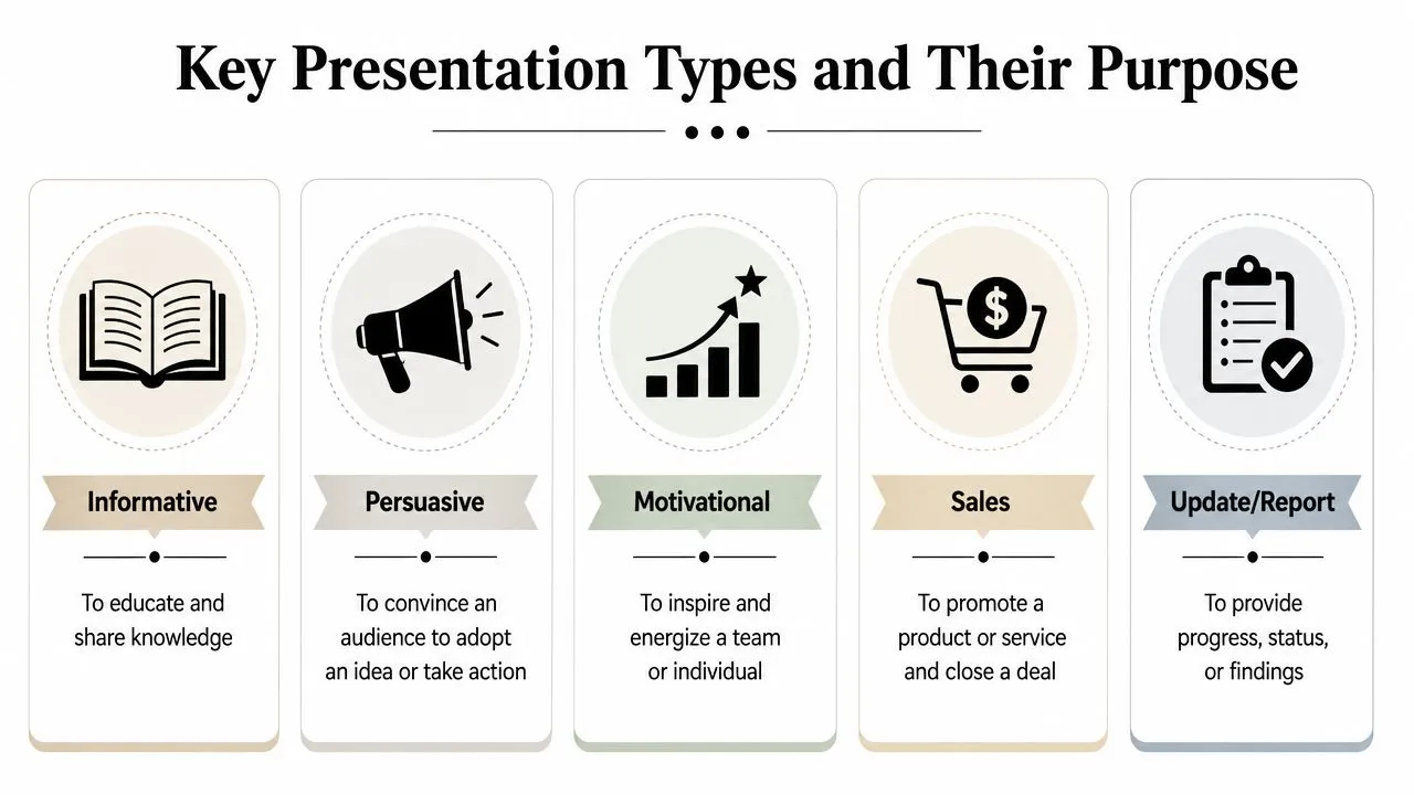
Choose the type before you build the deck
Different presentation types create different audience expectations.
If you're giving an informative talk, people expect clarity and explanation. If you're giving a persuasive one, they expect a case with reasons and stakes. If it's instructional, they need sequence, examples, and usable steps. If it's inspirational, they need energy, story, and a strong message.
A lot of weak decks are mismatched. The presenter brings data when the room needs direction. Or brings excitement when the room needs proof.
A simple comparison of common presentation types
| Type | Primary purpose | Audience expectation | Typical style |
|---|---|---|---|
| Informative | Help people understand | Clear facts and explanation | Calm, structured, visual |
| Persuasive | Win support or approval | Logic plus consequences | Focused argument |
| Instructional | Teach a process or skill | Step-by-step clarity | Demonstration and examples |
| Inspirational | Shift attitude or energy | Meaning and momentum | Story-led, emotionally resonant |
| Update or report | Share progress or findings | Efficiency and relevance | Brief, selective, decision-oriented |
Here's how that plays out in real work.
Informative
A research briefing, policy update, or market overview falls here. The audience wants to leave smarter than they arrived.
In technical settings, this category has an especially useful discipline. A technical presentation should begin with the problem and the purpose, then build each slide around one point supported by visuals. That approach is powerful even outside engineering because it prevents the common habit of dumping notes onto slides.
Persuasive
This is the presentation often secretly implied when one says they “have to present.” They want buy-in.
A budget request, strategy proposal, or leadership recommendation belongs here. The audience isn't just learning. They're evaluating. They want to know what you recommend, why it makes sense, and what happens if they ignore it.
Instructional and inspirational
These often get mixed together, but they're not the same.
An instructional presentation says, “Here's how to do the thing.” A keynote or rally talk says, “Here's why the thing matters.”
One gives the audience a method. The other gives them momentum.
If your audience needs to act tomorrow, instruction matters more than inspiration. If they need to believe before they act, inspiration comes first.
Building Your Presentation From the Ground Up
Starting from a blank slide can feel like staring at an empty kitchen counter with guests arriving soon. You know a meal has to appear. You just don't know what to make first.
A better approach is to build in layers. Don't open PowerPoint and immediately start decorating. Start with decisions.
Start with people not slides
Use this four-step workflow whenever you need to create a presentation.
-
Analyze the audience
Ask basic questions first. Who's in the room? What do they already know? What do they care about? What decision, worry, or goal are they bringing with them? -
Distill the message Reduce your whole presentation to one sentence. Not a topic. A message. “We should change vendors.” “This campaign taught us where the actual demand is.” “The rollout needs a slower phase-in.”
-
Outline the flow
Once the message is clear, choose the order. Lead people through the logic instead of dropping facts in a pile. -
Design the support
Only after the message and flow are solid should you build slides. At that stage, visuals support the talk. They don't lead it.
Many professionals struggle because they skip straight to slide-making. If you want a helpful model for sounding calm and credible in higher-stakes settings, this guide for powerful executive communication offers useful perspective on how leaders shape message and presence together.
Turn ideas into a clean flow
When you know your audience and core message, drafting gets faster. Try this simple planning sequence:
- Write the audience question: What are they really wondering?
- List your essential points: Keep only what supports the answer.
- Arrange the order: Put ideas in a sequence that feels inevitable.
- Match each point to a visual: Chart, image, simple diagram, or short phrase.
- Cut what doesn't serve the goal: Extra detail belongs in notes, not on every slide.
If you want a practical workflow for turning prompts into polished decks, this course on building professional slide decks and presentations with ChatGPT for PowerPoint shows one way to move from outline to finished slides without getting lost in formatting.
A simple test helps here. If someone read only your slide titles in order, would they understand the story? If not, the structure probably needs work.
Presentations in Action Use Cases for Professionals
Presentation skill becomes much easier to understand when you tie it to real work. Different roles use the same fundamentals for very different outcomes.
Digital presentation tools made that possible for far more workers. The shift happened rapidly between 1982 and 1987, when about a dozen software programs emerged for personal computers and turned slide creation into a mainstream professional task, helping non-technical roles like marketers and analysts automate reporting and visualize research, as outlined in this history of presentation software.
Consultants
A consultant rarely presents “information” in a neutral sense. They present a path forward.
One common scene looks like this: the client team already has too much data, too many opinions, and not enough clarity. The consultant's job is to reduce noise. A good presentation doesn't just show findings. It arranges them into a recommendation the client can act on.
That means the strongest slides usually answer three questions:
- What's happening
- Why it matters
- What we should do next
The confidence clients feel often comes less from flashy design than from clean thinking.
Sales teams
Sales presentations live in the space between trust and decision.
A weak sales deck talks too much about the product. A strong one talks first about the buyer's problem, then shows how the offer fits into that situation. That's why good sales presenters don't race through feature lists. They shape a story about relevance.
When teams need to create that kind of pitch quickly, a focused workflow matters. This practical course on creating a company presentation in minutes is useful for sales teams and founders who need a fast first draft they can tailor to the room.
HR managers
HR professionals present constantly, even if they don't always call it that.
Onboarding sessions, policy updates, manager training, culture briefings, and change announcements all depend on presentation skill. The challenge is rarely “how do I make this look polished?” It's “how do I make this clear enough that people understand it, remember it, and follow it?”
For HR, clarity beats cleverness. Short examples, clean sequencing, and plain language usually work better than dense policy slides.
People don't resist training because they hate learning. They resist it when the presenter makes the path feel confusing or abstract.
Non-technical managers
This group may benefit most from modern presentation tools because they often need to explain metrics, projects, and team decisions without a design background.
A non-technical manager might need to brief leadership on hiring progress, project risk, customer feedback, or team workload. The room doesn't need every spreadsheet detail. It needs the signal inside the noise.
The presentation becomes a translation tool. It turns scattered operational reality into a clear picture leaders can respond to.
Pro Tips for Delivery and Common Mistakes to Avoid
Even a sharp deck can fall flat if delivery gets rushed, stiff, or overloaded. The audience doesn't experience your preparation. They experience your pacing, your voice, your body language, and how easy you make the material to follow.
This visual sums up the balance well.
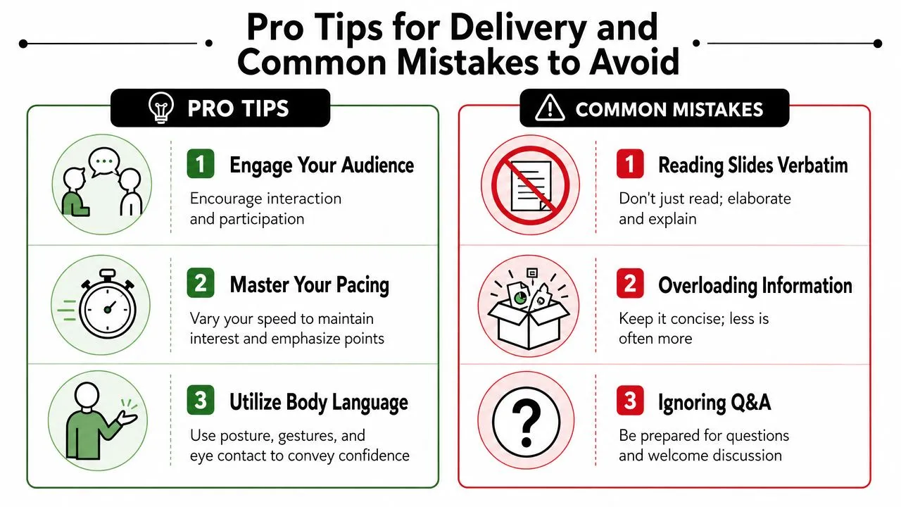
How to deliver with more control
For technical presentations, one useful benchmark is one to two minutes per slide, and a 15-minute conference talk typically fits 12 to 15 slides, based on guidance in this technical presentation pacing video. That rule helps prevent the classic mistake of sprinting through crowded slides at the end.
Physical delivery matters too. One presentation skills resource recommends facing the audience at about a 45-degree angle and moving side-to-side in relation to slide content. It also notes that visual size matters in larger rooms, with image height needing to suit viewing distance so far-away participants can still follow the material, as discussed in this presentation delivery video on standing and visuals.
A few habits make an immediate difference:
- Pause on purpose: Short pauses help people absorb key points.
- Look at people, not the screen: Your attention guides theirs.
- Let slides support you: Don't read them verbatim. Expand on them.
If you want extra ideas for participation and audience energy, this guide to engaging B2B presentations offers practical ways to make the room more interactive without turning the talk into a gimmick.
A quick visual walkthrough can also help you notice delivery habits you might miss in rehearsal.
Mistakes that quietly weaken a strong deck
The obvious mistakes are easy to spot. Tiny text. Busy charts. Reading every bullet.
The more important mistakes are often quieter.
One is failing to make the presentation accessible. A practical accessibility guide notes that 15% of the global population has a disability, and presentations that lack alt text, screen-reader-friendly layouts, and audio descriptions can exclude a significant part of the audience, as explained in this accessible presentations guide.
Start with a few simple habits:
- Use high contrast: Make text and visuals easy to distinguish.
- Write meaningful alt text: Describe charts or images when they carry information.
- Avoid layout chaos: Consistent reading order helps screen readers and humans.
Another mistake is treating Q&A like an afterthought. If questions are likely, prepare for them the same way you prepare slides. Anticipate concerns, objections, and requests for clarification.
Streamline Your Workflow with AI and Templates
Most professionals don't struggle because they lack ideas. They struggle because the presentation process eats time. Outlining, drafting, choosing slide titles, finding visuals, rewriting cluttered copy, and rehearsing all compete with the rest of the workday.
That's where AI can help. Not as a substitute for thinking, but as a speed multiplier.
Where AI helps most
AI tools are strongest at the messy middle of presentation work.
They can help you:
- Brainstorm angles: Turn a vague topic into several presentation directions.
- Draft an outline: Generate a first-pass structure you can refine.
- Rewrite slide copy: Shorten dense text into cleaner headlines and bullets.
- Create speaker notes: Expand a brief slide into talking points.
- Support practice: Some tools can help you rehearse, tighten pacing, and reduce filler words.
If you're comparing options for drafting and rewriting, this roundup of best AI writing assistant tools is a useful starting point for seeing which kinds of tools fit different writing tasks.
Templates help in a different way. They reduce design decisions. That matters when you want consistency without spending an hour choosing spacing, fonts, and layout from scratch.
For faster ideation, a curated set of ChatGPT prompts for presentations can help you move from blank page to usable outline much faster than improvising prompts on the spot.
What AI should never replace
AI can generate words. It can't take responsibility for your judgment.
You still need to decide what matters, what to cut, what your audience needs, and what tone fits the moment. You still need to check facts, simplify jargon, and make sure the presentation sounds like a person speaking rather than a machine producing polished filler.
Use AI to get to a better first draft faster. Use your own judgment to make it worth listening to.
That's especially important for non-technical professionals. AI lowers the barrier to making a decent deck. It doesn't remove the need for clarity, relevance, or human connection.
Your New Superpower Is Communication
A presentation is a structured way to help other people see what you see. Once that clicks, the task feels less theatrical and more practical.
You don't need to become a polished keynote speaker overnight. You need to understand the basic anatomy, choose the right type, build from a clear message, support it with simple visuals, and deliver it like a conversation that matters.
That's good news for nervous professionals, because those are all trainable skills.
The next time someone asks you to “put together a quick presentation,” you don't have to translate that as panic. You can translate it as responsibility, influence, and an opportunity to make complexity easier for other people.
If you want a practical way to build those skills with modern tools, AI Academy offers focused lessons for working professionals who want to create better presentations, write stronger prompts, and use AI to save time without sounding generic.